The design and layout process behind Little Engines' first book ARCHIVE
Get a behind-the-scenes look at the design and layout process (from the mood board to the sample pages to the meetings to printing) - a little inside scoop!

Hello friends! I had such a lovely time at AWP last week—I met so many amazing people, had a home at so many booths as I wandered around the bookfair, saw many people again who I’d met before at AWP and BK Book Fest last year. It was such a magical time!
(And if we met at AWP and you’re reading this, hello! Feel free to say hi in a message or email—hadleynikolehendrix@gmail.com—I’d love to stay friends!)
Last week, I posted a poll on my Instagram story asking what you’d like to see on this month’s Hadley House. The majority ruled on a case study of the Little Engines book ARCHIVE, and alas, here we are.
p.s. I did see those of you that were interested in the other options, and just know that I’ll still get to those, and I’ll try to include polls at the end of each post, in addition to posting them on my Instagram. In the meantime, if you have any questions on printing/ebooks/InDesign, always feel free to reach out.
So…how did the Little Engines ARCHIVE come about?
Adam Voith called me and threw out his idea of making a sort of “omnibus” or “anthology” from all the issues of Little Engines, including Issue 10 (which was still in the works, and which I was also going to layout). This would be Little Engines’ first ever book. The timing was a bit messy, the idea rambunctious and full of energy, and we needed to work fast if we were going to get it done before AWP. But Adam’s excitement made me excited, and so I said let’s do it.
This project was put together in a couple of months, a fairly fast timeline for a project this huge. Adam and I worked long hours, had impromptu phone calls (that, many times, were quite long due in part to both our tendencies to gab too much—which I quite appreciated; it’s rare I find someone who wants to be on the phone as much as me), and several hours of research. This collaboration was one of the most intense I’ve had, and I very much appreciated working alongside someone who was just as dedicated to it looking perfect. (Adam, if you’re reading this, your commitment to Little Engines is admirable, and I’m truly so happy I could work on this project with you. Thank you for trusting me.)
Initial design ideas
In our initial meetings, we discussed which pieces would be in the book and where they’d be. Adam already had some ideas about the design, so it gave me a jumping off point:
He thought the title page for each piece should be in color
He wanted it to feel thicker with generous margins, with his ideal page count being 300-400
He liked the idea of having blank (possibly black) pages for the 17 years the magazine was out of print to symbolize a break
He wanted to include what issue each piece came from (perhaps as a running head)
He wanted the last piece (Mike Nagel’s “The Unintentionalist”) to be visually different in some way—perhaps with colored pages
He wanted the body font to be a traditional and legible serif and the display fonts to have some connection to the original Little Engines font used for the issues—but perhaps not the exact one
Thinking about printing
Adam wanted to look into Bookmobile as our printer. After gathering a lot of information from their website and other sites, I put together a document that included the following:
Links to different uncoated papers to choose from
Things we needed to figure out (and my recommendations for each), such as…
if we were printing the entire book in CMYK on one kind of paper or using thicker paper inserts for pages that were printed in color (a decision which would majorly impact design and thus needed to be decided on before design began)
10 pt or 12 pt C1S cover
gloss, matte, or soft-touch matte lay-flat film lamination for the cover
interior paper stock
trim size
Other considerations, such as…
Cover 4/0 or 4/1 or 4/4
French Flaps
Any finishing
Binding
Examples of other literary journals
Pulling out journals from my shelf that were more book-like, I took photos of them and took note of their page count, trim size, whether they used a 4/0, 4/1, or 4/4 cover, how they laid out color in the interior, etc. I shared these notes with Adam, so he could get an idea of how things might look.
At this point, we were also gathering some quotes from the lovely and very patient Nicole Baxter (Director of Sales, Marketing, and Publisher Services at Bookmobile, who I was able to meet in-person at AWP and show her our finished book!) and waiting on some paper samples to come to us in the mail.
Finalizing printing decisions
After we received our paper samples, I put together another document that had my recommendations and reasoning for each decision so we could nail things down. Many of these printing considerations had to be decided before the design could begin so we didn’t end up in a pickle.
I also included a survey for Adam to fill out within the document so he could either agree or disagree with my recommendations and we could come to a conclusion on each decision and keep the ball rolling.
Once all printing decisions were finalized, the design started. We still communicated with Nicole throughout some of this process as we learned more and tried to see if different options would produce a lesser cost or a better quality. There was still some ebb and flow occurring, but these were our final printing decisions:
5.5 x 8.25
342 pages
4-color (CMYK) on 70# natural Cougar opaque smooth with bleed
Cover on 10pt C1S/white stock with matte layflat lamination, bleeds, 4/1 (meaning the outside cover is printed with 4 colors, and the inside cover is printed with 1 color—we chose black for the inside).
Perfect binding
Okay, but what’s the ~vibe~?
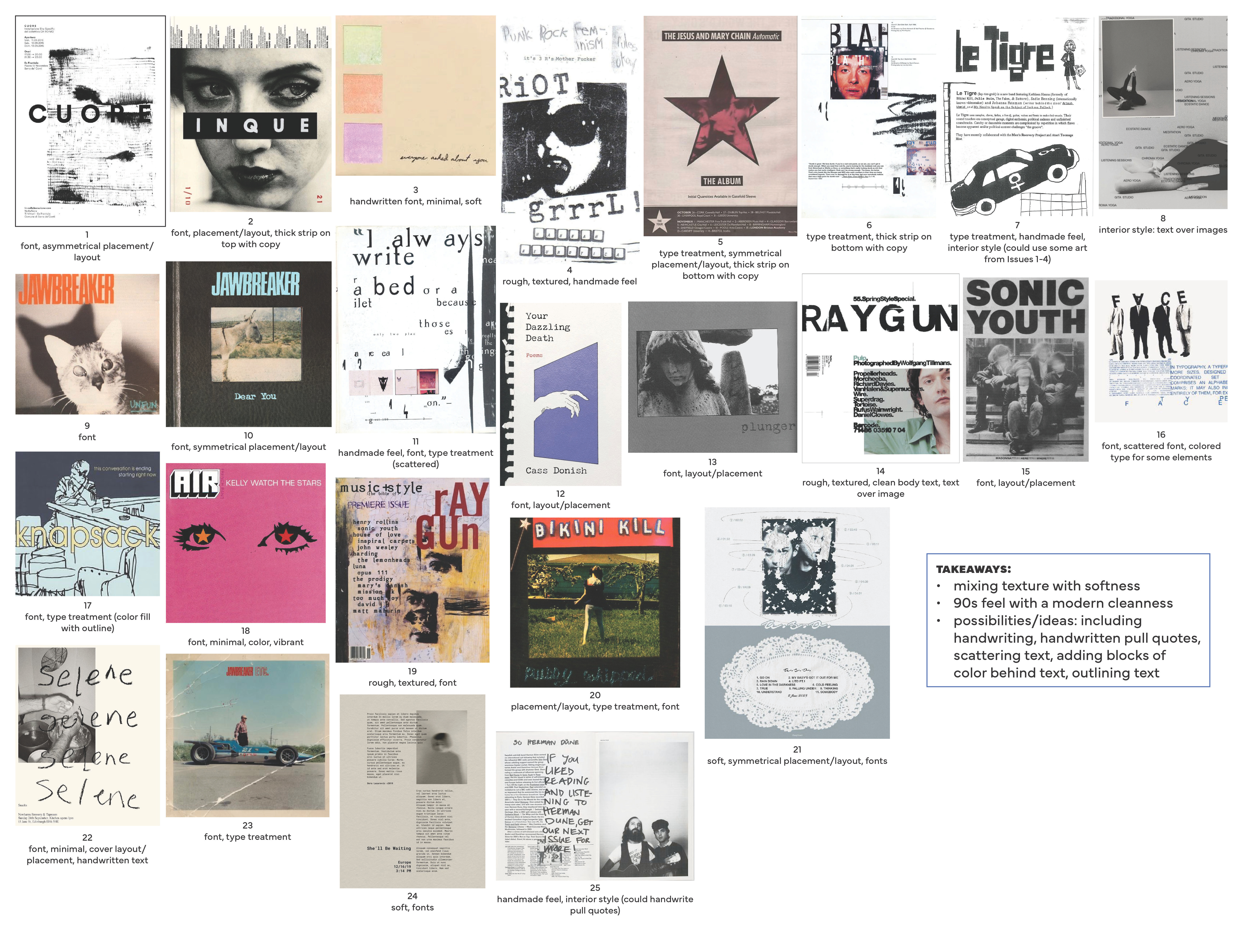
Looking at Little Engines Issues 5-9 (which I’d picked up at AWP 2024) + the pdfs of the older issues that Adam sent me, I made a mood board for ARCHIVE. I placed the reason why each image was chosen underneath it, so that we could have a more productive conversation about which ideas he was feeling and which he wasn’t. Here are some ideas that inspired the mood board and the thinking behind it:
Adam said he felt the magazine was reminiscent of Jawbreaker, so I started there and worked outward to create a punk rock, post-hardcore tone
But! He also didn’t want it to be too 90s. So, I pulled in some other reference images (leaning on album covers a lot, since Little Engines is tied so much to the music industry—and I also love using albums as inspiration)
From our conversations, it felt like this book should feel like a book you want to sit down and read, but it should still be fun, have a magazine quality, and connect to the design of the Little Engines issues. And so, I set out to design ARCHIVE in a way that it’d feel like both a book and a magazine.
Just a reminder this post is too long for email and may be cut off short. You can view it in your browser here, so you can be sure you see the full post.
Work-in-progress thingy wingys*


Normally, I’d never share my embarrassing mountain of WIPs for a project, but like I said, this project was like no other, and Adam and I were communicating constantly. These WIPs were only for the cover and were just for me to get a feel for how the cover should look so I could start designing the interior to match. Like I described in my post about designing the cover for Baby Cerberus, I really try to think of every single permutation of how a design could look, duplicating pages over and over again with minor tweaks so there are a variety to choose from.
He seemed interested in seeing them, and since our deadline was fast approaching, I sent him the WIPs—over 100 pages (like I said, I’d normally never bombard a client with that much to go through, and I truly didn’t expect him to sift through them, but they were there if he wanted them). He ended up giving me his ideas and feedback, and this helped pave the way for the interior.
Adam was pretty sold on using the collage art on the cover, but I tried out some other art that’s in the book just to give some more options. However, we decided that the collage fit the mood the best.
* Thingy Wingy: reference to a Brian Jonestown Massacre album. If you know, you know.
Round 1 Sample Design
The Round 1 Sample Design shows a representative portion of the interior. I try to account for all possible variables during the sample design, such as:
what the longest and shortest piece titles look like on their title page and in the running feet
where art will be placed within each story (always at the start, sometimes in the middle, sometimes full page, etc.)
how often elements are used and how to treat them accordingly (ex. there are a few “intros” in ARCHIVE, so the styling of the title pages had to take this into account)
and plenty more
Below are some pages from the Round 1 analysis (I provide an analysis for every sample design so clients can see what decisions were made and why). You can click on each of the images below to see them better, but I’ll walk through each of them briefly.
Margins

Adam mentioned he wanted a thicker book with generous margins. With this in mind, I positioned the text block up and toward the spine, rather than centering it on the page. This provided ample room for “parent page items” (page numbers, running feet, and the Little Engines / ARCHIVE on the sides) and provided more opportunity to play with design and make it have more of a “magazine” feel.
Fonts

The body text font, Arno, is a traditional serif that lends itself to being very book-like, and the display font, Millesime, is reminiscent of the font used in Issues 5-9.
Parent Page Elements

Balance, harmony, and practicality were all factors that contributed to the positioning and colors chosen for the elements that would be on nearly every page.
“Intros”

There were only a couple of “intros” that prefaced a piece. Taking into account the layout of other title pages, I styled the intros to be a bigger font size and set on their own page.
Colors

For the pink, I actually sampled the Air album cover that was part of the mood board and used it as our main color. I created a lighter tint of the pink to use on title pages, and for Mike’s piece, I used—what I like to call—a “frog green.” I used this green for the bars I created along the sides of his piece, with the idea being that this color would show on the edges of the book when closed and clearly differentiate it from the rest of the pieces.
Round 2 Sample Design
We had a meeting to discuss all of Adam’s feedback on the interior pages, and I implemented the respective revisions in Round 2, showing him what was changed in another analysis.
Again, I’ve included some pages from this analysis below with some brief notes to accompany each.
Title Pages

We made the titles smaller, changed the byline font, and changed the wording of the art credit.
“Intros”

We changed the intros to be more cohesive with the rest of the book, so they wouldn’t disrupt the design of the title pages as much.
Colors

Adam wasn’t feeling the frog green, and honestly I was having a difficult time deciding which color would pair well with the pink and not make it look like an overloading of color, so I don’t blame him. The frog green wasn’t it. Adam sent me the hex code for the “Little Engines blue” and it was perfect.
I provided another color palette option in the analysis, just in case he wasn’t content with it, but we both really liked the blue paired with the pink.
The Typesetting
After the interior design was approved, I started typesetting. This is one of my favorite parts of the process, but it unfortunately doesn’t lend itself to photos (as it seems like it would just be me pointing to pages and saying, “yay, see—no text stacks! wow, no letter stacks! look at that tracking! no widows or orphans to see here!” (though, of course, nothing is perfect, and typesetting is a balancing act of the lesser of two evils). But, I’ll give you the scoop on what I focused on while typesetting:
readability and accessibility
avoiding word stacks, especially at the ends and beginnings of lines
avoiding letter, punctuation, and hyphenation stacks (when unavoidable—when readability was compromised in other areas, ensuring there were no more than 3 letters, punctuation marks, or hyphens in a row)
avoiding rivers and tight lines
avoiding hyphenation of proper nouns
ensuring words connected to dashes break after their existing dash
keeping numbers with their partner
keeping proper nouns together
avoiding words breaking across pages
Here’s more of an inside scoop into the typesetting process, if you’re intrigued.
And, of course, there were the different typesetting versions that came after the first, where the proofreading corrections were implemented.
The finished product!
Okay, so not only does the book look killer (if I can toot my own horn a little), it has an incredible line-up: Damien Jurado, Kevin Morby, Mike Nagel, Justin Vernin (Bon Iver)—just to name a few. Seriously, this book is so sick. And, if you’re thinking about printing with Bookmobile, maybe having a flip through ARCHIVE will help you decide (they did such a gorgeous job). Grab a copy here!
News for you!
If you couldn’t be at AWP, here’s some things I learned that you may be interested in (only listing a few because I don’t want to overwhelm with information and there was so much to take in):
Mom Egg Review: early bird submissions are open April 23-30 (or until Submittable limit) and are free!
Texas Review Press: submissions for “The World We See: Women Poets on Neurodivergence” are open until May 31
IBPA Publishing University is having their annual conference in St. Paul, Minneapolis May 15-17
I met LAMARKS at AWP and she wrote this fantastic article about her experience, which I loved reading about!
Projects I’ve worked on that are now available for you to pre-order / purchase!
ARCHIVE: Selected Work, Issues 1-10 (Little Engines, 2025)
My role: Cover & Interior Design & Typesetting
Little Engines: Issue Ten (Little Engines, 2025)
My role: Cover & Interior Design & Typesetting (working off the original design by Marianna Fierro)
The Glass Garden by Jessica Lévai (Lanternfish Press, 2025)
My role: Interior Design and Typesetting
The Barefoot Followers of Sweet Potato Grace by Megan Okonsky (Lanternfish Press, 2025)
My role: Interior Design & Typesetting
What I’m reading
Cabinet: Issue 62 / Milk (Fall 2016–Winter 2017)
The Form of the Book by Jan Tschichold (Lund Humphries, 1975)
The Chicago Manual of Style, 18th Edition (University of Chicago Press, 2024)—still reading this—cover to cover!
What I’m listening to


Deux | Decadence (2010): minimal synth
Out Hud | S.T.R.E.E.T. D.A.D. (2002): indietronica, dance-punk, post-rock
Moby | Play (1999): downtempo
Dear Reader . . .
Did we meet at AWP? Did you hear about me there? Drop me a line and say hello!
You can reply to this email, leave a comment, or click on the buttons below. I respond to every message. 🙆🏻♀️
Also for you:
Thank you for reading Hadley House!
If you liked this post, I’d love it if you could “heart” it! Your support means a lot. Thank you <3
Subscribe to receive new posts about editorial design and typesetting!
And, in case you missed it…

Hadley Hendrix is an Editorial Designer based in Chicago, specializing in publication design and typesetting. She works with publishers, magazines, and authors to design, layout, and typeset the covers and interiors of their publications. From ensuring an authentic representation of a publication to using em dashes and en dashes correctly, she immerses herself in the details of every project to create a polished product. Visit hadleyhendrix.com to see some of her work.
Need a designer or typesetter? Just want to pop in and say hi? I’d love to talk with you! You can email me at hadleynikolehendrix@gmail.com, or say hello on Instagram or LinkedIn. (-: