6 Guidelines to Follow When Typesetting
Learn how to typeset your book, magazine, or other publication to be readable and accessible. It's so important in crafting a great reading experience!


It’s been too long! I know so many of you were patiently awaiting a Hadley House post to pop into your inbox last month, but alas I came down with tonsillitis, which turned into a respiratory infection (which I’ve never had, but it is awful—wouldn’t recommend), and I feel like I’ve been playing catch up on all my work since then.
And since I’m playing a bit of catch up: before I get into what you’ve all been waiting for—the 😯 typesetting guidelines 🫨—I want to know if you’re going to AWP!
Typesetting Guidelines
I’ve recently been conducting “typesetting analyses” of each book I read. What does this mean? Well, have you ever been reading a book, and then you read a line over again that you just read? Or, do you ever get confused where you are and lose your place? Or you get distracted because you notice a line that looks different from the others (it’s spaced weird—it’s too tight or too loose)? Through these typesetting analyses, I pay attention to when/where I struggle with a piece of text to determine why that is and how it could be fixed.
Typesetting is the art of formatting the text to avoid these reading stumbles, prioritizing an accessible reading experience. However, typesetting also involves compromise. If you fix one problem, you may very well create another. When stuck in a typesetting pickle, you have to weigh your options and consider which problem compromises author intent, readability, and accessibility the least. It’s a delicate and tedious puzzle that is one of my favorites to figure out.
Based on these analyses, my own reading experiences, and my expertise in typesetting various publications, I’ve compiled 6 important guidelines to follow when typesetting. Each explains what it is, why it’s important, and how you can implement it using InDesign.
1. Proper nouns should stay together
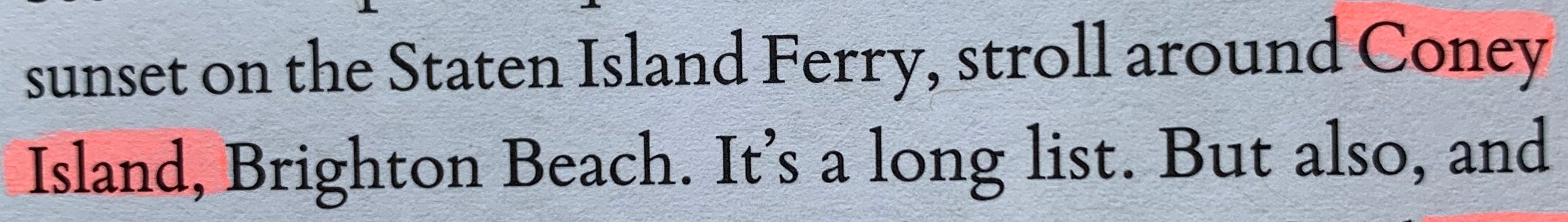
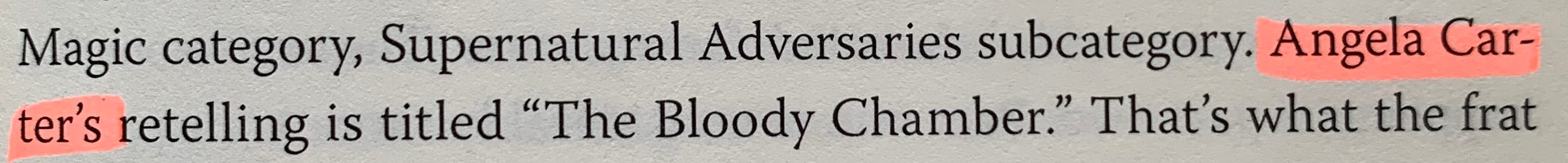
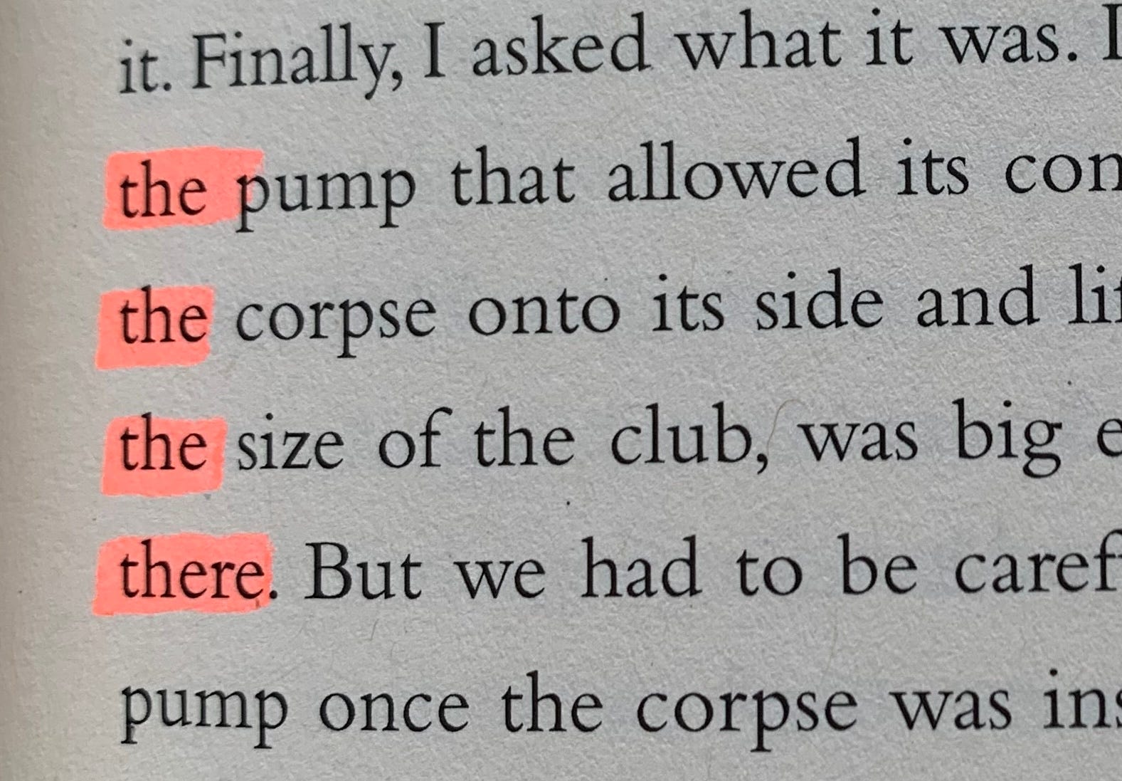
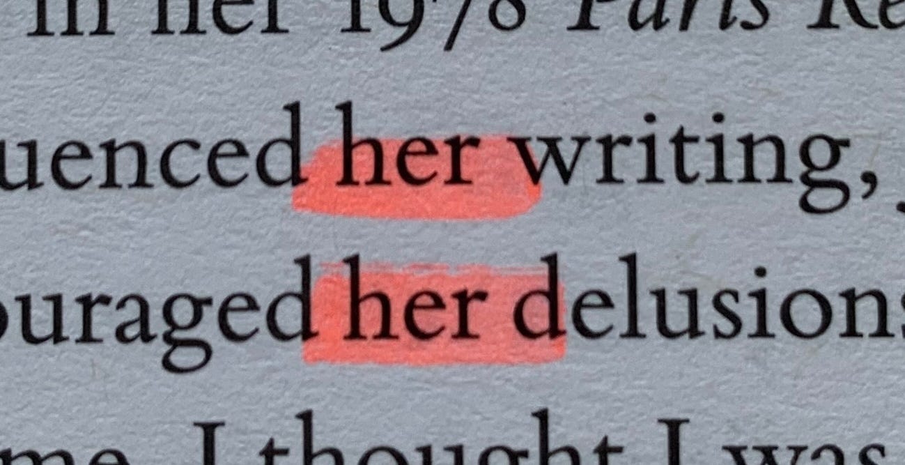
Proper nouns, like names of people, places, and organizations, should stay together whenever possible. If they are broken (across a line or a page), it may lead to a pause in reading or some confusion. For example, if “New York” is separated, with “New” at the end of one line and “York” at the beginning of the next, it creates a slight pause when reading. We may have an initial assumption of what we think it’s going to be (“New Hampshire,” perhaps), but then when our eyes move to the next line, it disrupts our reading flow because we weren’t expecting “York.” Keeping them together creates a smoother reading experience.
But how do you keep them together?
When I’m prepping my text for typesetting in InDesign, I do a GREP search for 2+ capitalized words.
Edit > Find/Change (or Cmd/Ctrl+F) > click on the GREP tab
Find:
\b\u\w+(\s+\u\w+)+Change Format:
Underline Options > check Underline On
Weight: 8pt (adjust accordingly to get your desired highlight effect)
Offset: -4pt (adjust accordingly to get your desired highlight effect)
Color: choose any color you want
Tint: 60% (or whatever you prefer)
Change All
This GREP find/change will find 2+ capitalized words, then highlight them so that when you’re typesetting, you can see which words may need to stay together. As you go through your document, you can insert a No Break character between the words you want to stay together (Character panel > palette menu > No Break), or you can insert a Non-Breaking Space (Type > Insert White Space > Non-Breaking Space).
I use this highlighting method for a few reasons:
Not all proper nouns are separated from each other, and thus don’t really need the “glue” (No Break or Non-Breaking Space) to keep them together. I prefer to only insert them where needed.
As I said before, typesetting is about compromise. In some situations, it may be best to have them separate rather than force them together and create other typesetting problems.
Because this GREP search doesn’t specifically search for “proper nouns,” but instead just 2+ capitalized words, it also includes the words at the beginning of a sentence. So, if a sentence started with, “When Hadley went to the store,” it would catch “When Hadley.” Since “When” isn’t part of “Hadley,” I don’t need them together, and if I were to instead insert a No Break or Non-Breaking Space instead of using the highlight, it would glue instances like these together.
Note: Keep in mind that if you’re converting to ebook, No Break characters will not be retained, but Non-Breaking Spaces will be.
But what about things like “Ms. Hendrix” or “Dr. Hyde”? Unfortunately, this GREP expression doesn’t pick up the period in these instances and so won’t highlight them. For these, I typically do the following:
Find/Change > click on the Text tab
Find: Ms.
Change Format: [use your underline settings from above]
Change All → will highlight all instances of “Ms.”
Then, I repeat for: Mrs., Mr., and Dr. (let me know if I’m forgetting any others that I need to add to my list!)
Unfortunately, this means the GREP expression also won’t catch things like initials (H. N. Hendrix). (If you know of an expression that will catch these, let me know!) So, when I’m looking through the document, I make sure to watch for instances like these.
2. Numbers should stay together
Imagine you’re making a recipe. Your hands are sticky, you’re flustered, and you’re glancing over at the open page in your cookbook trying to find what to do next. The fraction “1/2” is separated at the end of one line from its corresponding measurement “tablespoon” beginning on the next line (or even worse, on the following page!). This can cause confusion and frustration to try and find the next line to see what the measurement is (and what if you accidentally read a different line and see “cup” instead of “tablespoon”? It could end badly!).
In the same way that proper nouns are treated as a single unit and should move with each other, numbers and their partners should stay together as well.
In recipe books, it’s especially important because the context in which someone reads a cookbook is very different from that of a novel. You must consider the reader and how they will experience the book. Always ask yourself why you are doing something.
How can you keep them together?
Find/Change > click on the Text tab
Find: ^9 [this searches for any number]
Change Format: [use your underline settings from above to add a highlight]
Just as before, when I’m going through the document, I will consider each instance of these highlighted numbers and determine if I should include a No Break or Non-Breaking Space between the number and its partner.
3. Avoid “bad hyphenation”
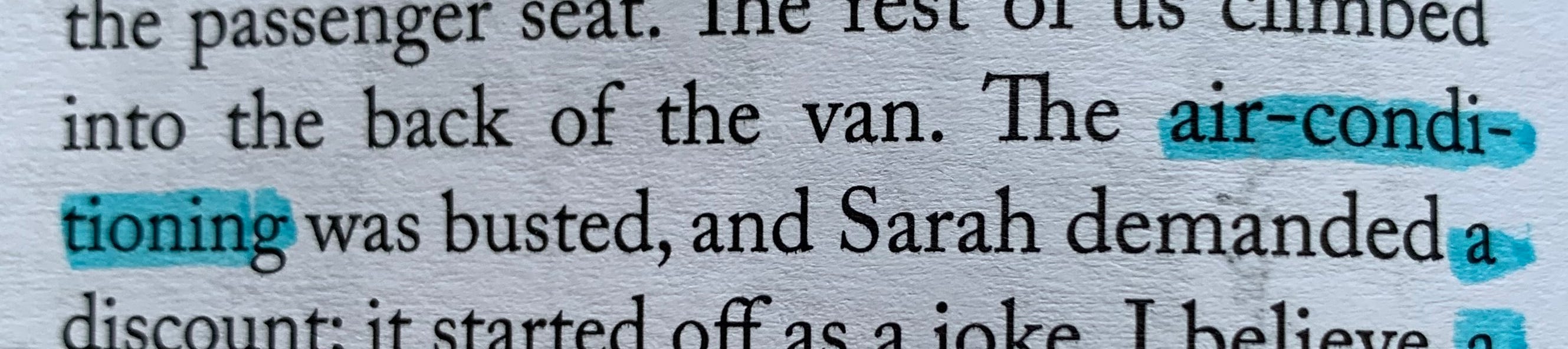
For words that already have an existing dash (such as “air-conditioning” above), it’s best to break them after that dash, instead of inserting another hyphen in the middle of the word. Breaking it in the middle of the word, rather than at the existing hyphen, could confuse the reader and disrupt the reading flow. However, breaking it after “air-” aides the reader in recognizing that it’s a compound word.
Similarly, it’s best to hyphenate a word at its syllabic or root break. For example, “association” could be broken at the following syllabic breaks: as-so-ci-a-tion. Syllabic breaks follow the natural pronunciation of the word, making the split feel intuitive and natural. Splitting a word at an arbitrary point (such as “be-autiful” instead of “beau-tiful”) could cause the reader to misread the word.
And, similar to Guideline #1 (proper nouns should stay together), it’s best if proper nouns aren’t hyphenated. This avoids confusion/misinterpretation of the words.
How can you avoid it?
InDesign typically does a good job at breaking words after a syllabic break. However, I always scan every page looking for words that are hyphenated at the end of a line. If I see one that doesn’t break at a good place (not at a syllabic break or InDesign hasn’t broken the word after an existing dash), I fix it.
If I’m not completely sure what the syllabic breaks are for the word, I check Merriam-Webster to ensure I break it appropriately.
I insert a discretionary hyphen where I want it to break (Type > Insert Special Character > Hyphens and Dashes > Discretionary Hyphen, OR Cmd/Ctrl+Shift+-).
For avoiding hyphenation of proper nouns: in the Paragraph Style (double click your paragraph style, or go to the palette menu for more options), under Hyphenation, I uncheck “Hyphenate Capitalized Words.” If I’m adjusting paragraphs later on and notice that perhaps the paragraph would read better if it hyphenated capitalized words, I’ll do a local override (with my cursor in the paragraph, I’ll go to Paragraph > palette menu > Hyphenation > check Hyphenate Capitalized Words), which will only apply to that paragraph. This way, it happens only in situations where it may be necessary, instead of throughout the entire document.
4. Avoid word, letter, punctuation, and hyphenation stacks
This is where things start to get tricky, and avoiding stacks is something I prioritize during typesetting as it significantly impacts readability and can result in disruptions and the mistaken re-reading of certain lines.
How do you fix stacks?
Unfortunately, these are a bit less easy to fix and require some patience. Here are some different methods I use to get rid of them:
First, I use this free script to identify the stacks. I save my document as a new file before running it just in case anything goes wrong, then I run it three times for the following: Word Stacks and Hyphenation Stacks, Same Letter at Start or End of Line, Same 3 or More Letters at Start or End of Line. This applies a character style to them with an underline (unfortunately, because it’s a character style and not local formatting, it will not preserve any styles you’ve applied to the text—such as italics. So be careful when getting rid of this underlining later, ensuring that you check with the original document to see if there was a style that you need to reapply).
I adjust the tracking for certain lines in the paragraph to see if things will shift in a favorable way.
Sometimes, I’ll insert a No Break character to see if that fixes things.
I adjust the hyphenation and/or justification settings for just that paragraph (Paragraph > palette menu > Hyphenation / Justification), which creates a local override. When I’m in the Hyphenation or Justification panels, I make sure I have Preview turned on so I can see if things are shifting to produce a favorable outcome.
If worse comes to worst (and I try to avoid this at all costs because it can create further issues, especially if someone else will ever be editing the InDesign doc), I see if a Forced Line Break (Type > Insert Break Character > Forced Line Break, OR Shift+Enter/Return) will fix the problem (without creating other noticeable dilemmas).
Note: Forced Line Breaks will be preserved when converting to an ebook, which is bad! If you’ve used Forced Line Breaks, make sure you do a Find/Change and get rid of them before converting to an ebook.
5. Avoid “bad breaks”
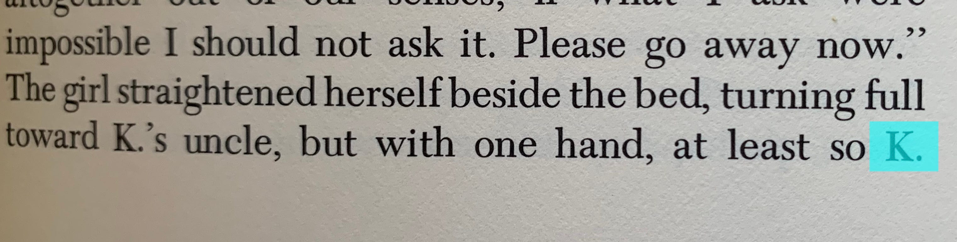
Imagine a situation where you have initials at the end of a line (“H.”) and the rest of the name at the beginning of the next line (“Hendrix”). This period becomes quite confusing because we can’t see that there’s something following it, and because the period is at the end of the line, this further confirms in our mind that there should be a break.
The above example shows a similar situation where the character’s name is “K.” and “K.” is at the end of a line, with the rest of the sentence continuing on the following page. A line break may definitely lead to confusion, but a page break is an even more abrupt break, leading to more disruption in the reading flow (potentially leading to the reader flipping back to the previous page to make sure they read the sentence correctly).
How can you avoid them?
Similar to the solutions for stacks, I utilize the following techniques:
Adjust tracking
Insert a No Break character
Adjust Hyphenation and Justification for that particular paragraph
6. Lines shouldn’t be too loose or too tight

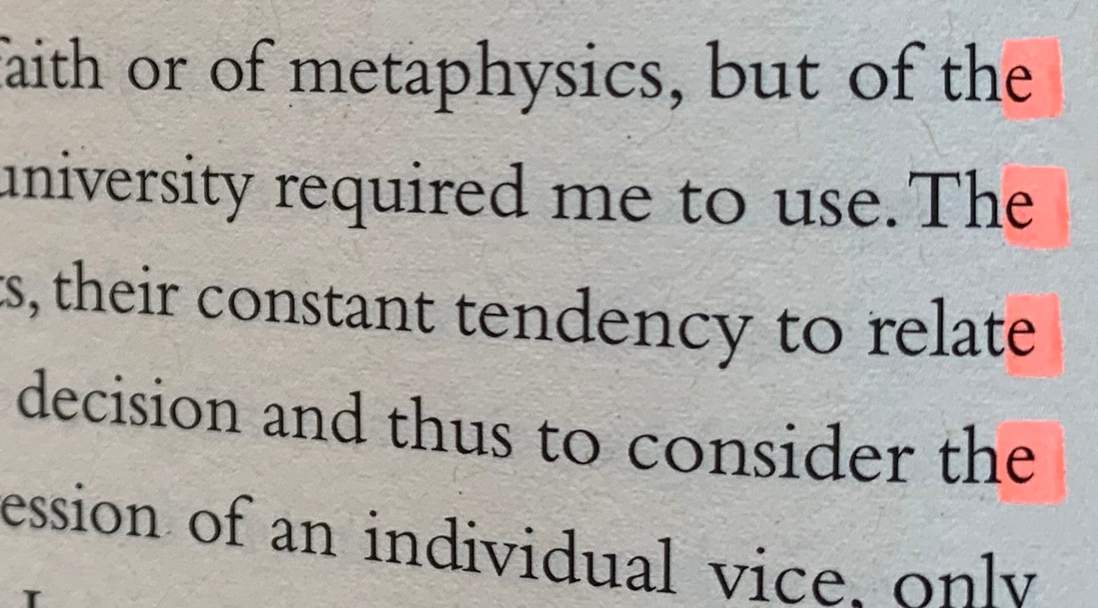
Lines that are too loose can lead to “rivers” in the text. Rivers are gaps of white space that flow through the text block and cause our eyes to become less focused on the text and more focused on the shapes the white space creates. This disrupts the natural flow of reading.

Lines that are too tight can lead to letters colliding with each other and not enough space between words. This can result in the reader being confused about where one word ends and another begins. It impacts the reading experience, making it less accessible and disrupting the flow.
How can you fix it?
I always have my H&J Violations turned on in InDesign (InDesign/Edit > Preferences > Composition > check H&J Violations), which highlights in yellow where there are hyphenation and justification issues. When I’m setting up the paragraph styles, I go to a page that has a lot of yellow highlighting (a lot of H&J Violations). When I’m changing my Paragraph Style Options, I have Preview turned on so I can see if the adjustments I’m making result in less yellow highlighting.
Here are some settings that I start off with (and fiddle around with as needed):
Hyphenation
Words with at least: 5 letters
After first: 2 letters
Before last: 3 letters
Hyphen limit: 3 hyphens
Hyphenation zone: 0.5 in
Better spacing / fewer hyphens slider: right in the middle
All of the following are unchecked: Hyphenate Capitalized Words, Hyphenate Last Word, Hyphenate Across Column
Justification
Word Spacing:
Minimum: 83%
Desired: 100%
Maximum: 130%
Letter Spacing:
Minimum: -3%
Desired: 0%
Maximum: 3%
Glyph Scaling:
Minimum: 97%
Desired: 100%
Maximum: 103%
Auto Leading: 120%
Single Word Justification: Full Justify
Composer: Adobe Paragraph Composer
These settings typically reduce the highlighting quite a bit. However, you’ll never be able to get it completely perfect. So, when I run into some yellow highlighting (the brighter the yellow, the more of an issue InDesign perceives it to be) when I’m typesetting, I consider whether the line is actually too loose or tight. Sometimes, I may just be able to leave it as is. If I do need to fix it, I use the following techniques:
Adjust tracking
Adjust Hyphenation and Justification settings. My first course of action here is to adjust the Better Spacing / Fewer Hyphens slider in the Hyphenation settings.
Conclusion
This is by no means a comprehensive list of all the variables you have to take into account when typesetting. However, these are some of the things I’ve noticed that I pay attention to the most when I’m reading.
As you might suspect, many of these issues can occur in the same paragraph. In addition, when you’re trying to fix one problem (a word stack, for example), it may lead to another problem (like very loose lines).
Typesetting requires gentle gives-and-takes to craft the perfect text block. Each paragraph, page, and chapter is made with lots of love and attention to detail. My goal is to make the reading experience as smooth, clear, and accessible as possible.
News for you!
I was featured in this Creative Bloq article The Best Fonts for Books by Polly Allen (^:
My boyfriend Alex reviews films, and I think he’s really quite good at it! If you’re a film buff, you should consider subscribing / reading his stuff.
Westchester Publishing Services has a free white paper you can download about how to make ebooks accessible in response to EAA regulations: Guidance on EPUB Accessibility
I revised my website a little bit, with new projects, a Welcome Packet, and more information about working together!
Projects I’ve worked on that are now available for you to pre-order / purchase!
The Glass Garden by Jessica Lévai (Lanternfish Press, 2025) — My role: Interior Design and Typesetting
The Barefoot Followers of Sweet Potato Grace by Megan Okonsky (Lanternfish Press, 2025) — My role: Interior Design & Typesetting
The Momentum List by Stephen V. Peters (self-published, 2025) — My role: Interior Design & Typesetting
The Grace of Black Mothers by Martheaus Perkins (Trio House Press, 2025) — My role: Typesetting
Splice by Anthony Borruso (Trio House Press, 2025) — My role: Typesetting
What I’m reading
Sphinx by Anne Garréta (Deep Vellum, 2015)
FENCE - Vol. 22 Issue 2 (Spring 2024)
Design Is Storytelling by Ellen Lupton (Cooper Hewitt, 2017)
The Chicago Manual of Style, 18th Edition (University of Chicago Press, 2024) - yes, I really am reading this, cover to cover!
What I’m listening to


Marcel Dettmann | Berghain 02 (2008): minimal techno
Thurston Moore | Rock n Roll Consciousness (2017): alternative rock, noise rock
Stereolab | Dots and Loops (1997): art pop, indietronica, ambient pop
Dear Reader . . .
Many times when I tell people I’m a Typesetter, I get a confused look and quite often have to explain what I do. I feel like typesetting is somewhat of an invisible art form in the sense that many don’t understand what it is or how it impacts the reading experience. I’m curious to know if you’ve ever noticed these typesetting “no-nos” before when you were reading, or if this post helped you understand why you may have read a line over again last time you were reading a book.
You can reply to this email, leave a comment, or click on the buttons below. I respond to every message. 🙆🏻♀️
Thank you for reading Hadley House!
If you liked this post, I’d love it if you could “heart” it! Your support means a lot. Thank you <3
Subscribe to receive new posts about editorial design and typesetting!
And, in case you missed it…

Hadley Hendrix is an Editorial Designer based in Chicago, specializing in publication design and typesetting. She works with publishers, magazines, and authors to design, layout, and typeset the covers and interiors of their publications. From ensuring an authentic representation of a publication to using em dashes and en dashes correctly, she immerses herself in the details of every project to create a polished product. Visit hadleyhendrix.com to see some of her work.
Need a designer or typesetter? Just want to pop in and say hi? I’d love to talk with you! You can email me at hadleynikolehendrix@gmail.com, or say hello on Instagram or LinkedIn. (-: