

How to Optimize Text for Typesetting in InDesign: 6 Easy Steps
Clean up your manuscript and prep your text for typesetting with these InDesign optimization tips.

Hello! It’s been a crazy couple of months—I’m happy to be back with another Hadley House post. This month I bring to you: optimizing text!
What is optimization, you ask?
Well, it’s the process of cleaning up the text and prepping it for typesetting before applying styles and formatting.
Manuscripts tend to have lots of unnecessary non-printing (or “hidden”) characters, including double spaces after periods (an outdated habit—only one space should come after a period), extra hard returns to indicate section breaks, manual tabs used for paragraph indents, etc.
When should you optimize your text?
Optimizing should take place right after you’ve placed your manuscript into your InDesign file. It cleans all the text up and makes everything tidy before you start typesetting. You want to start off with a clean slate and build up from there! Performing these actions during or after typesetting could wreak havoc on any intentional hidden characters you’ve included.
Why is optimization important?
Optimization allows you to start with a clean document, allowing for:
paragraph and character styles to be applied consistently and precisely (ensuring that if you need to change something, you only need to change that style)
flexible layout adjustments (for example, instead of using a carriage return to create a line of space, perhaps you want it to be a bit smaller—you could change the Space Before or Space After settings in your paragraph style, and it would apply this to all instances)
better ebook conversion
If you’re converting to an ebook later on, your document will be set up for success and avoid layout mishaps (multiple spaces, for example, will convert to a single space in an ebook). Optimizing your text is best practice anyways, but it’s crucial when converting to an ebook. If you’re thinking, oh that’s okay—we don’t need an ebook: beware! If you ever do need that ebook, it’s going to be a heck of a mess to sort out if you didn’t optimize your text.
In sum, a clean document means less manual tweaking, easier style management and global changes, consistent formatting, avoiding rework during ebook conversion, and improved efficiency!
First things first…
Make sure Show Hidden Characters and Show Text Threads are on. This allows you to see all non-printing characters (paragraph returns, spaces, tabs, non-breaking spaces, line breaks, etc.) and see exactly what’s happening in your document.
How:
Type > Show Hidden Characters (if it says Hide Hidden Characters, it’s on!)
View > Extras > Show Text Threads (if it says Hide Text Threads, it’s on!)
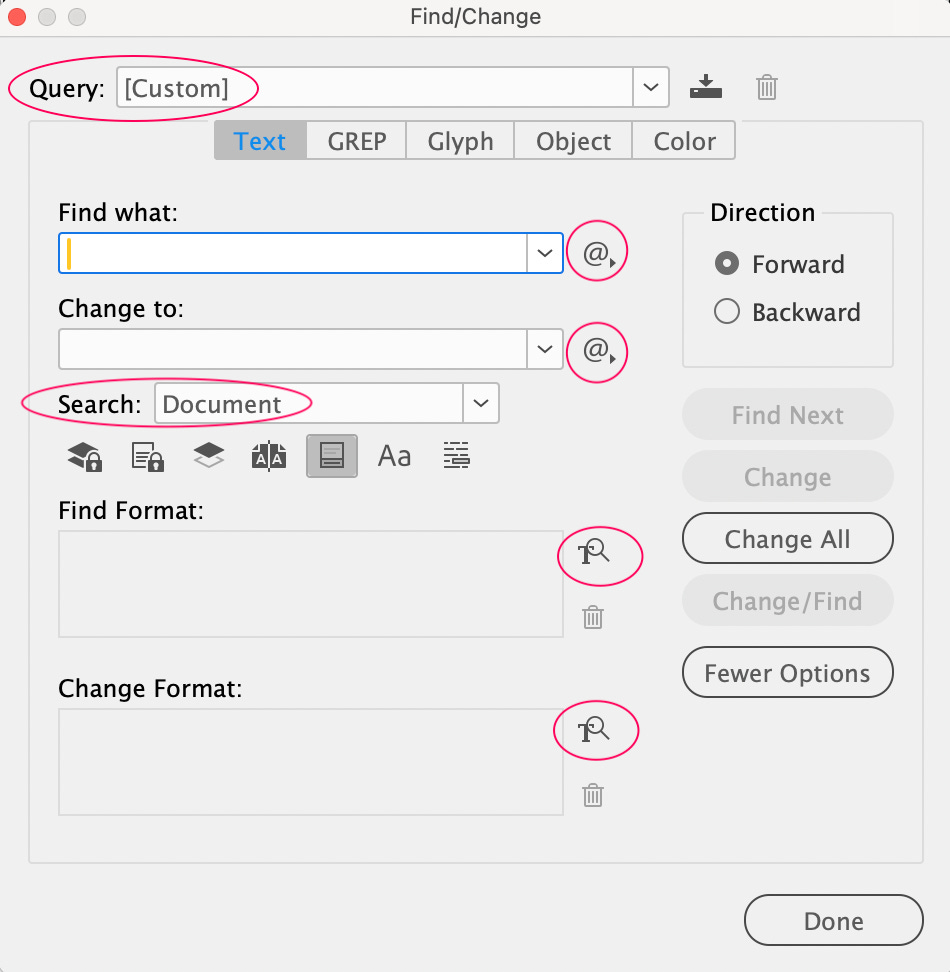
Ready to optimize? Here’s some tips about Find/Change before you do!
Before using Find/Change:
Always clear the Find/Change fields (there could be invisible characters that are in there left over from a previous Find/Change)
Ensure you’re searching the entire document (Find/Change > Search: Document)—unless of course, you don’t want to do that (but for our purposes here, we do)
Also know that you can select the @ symbol next to the Find and Change fields to search for special characters and expressions.
@ to find expressions, and how to search for a format.Let’s optimize!
Use Find/Change to complete the following tasks (Edit > Find/Change or CMD+F).
1. Remove extra spaces and end of paragraph returns
If you need this extra space, you should build this into a paragraph style using settings like Space Before or Space After. If you’re working with poetry and there are several purposeful spaces or tabs in the middle of a line, you should use one space and however many non-breaking spaces (CMD+OPT+X) you need to create the same look (non-breaking spaces will be retained in ebook conversion).
GREP
Query: Multiple Space to Single Space
Change All
GREP
Query: Multiple Return to Single Return
Change All
2. Remove spaces at the beginning and end of paragraphs
GREP
Query: Remove Trailing Whitespace
Change All
TEXT
Find: ^p [include a space after the p]
Change: ^p [no space should follow this p]
Change All
3. Remove extra tabs
Instead of tabs, you should use indents that are built into paragraph styles.
TEXT
Find: ^tChange: [leave empty]
Change All
4. Change straight quotes to curly
This should’ve happened by default when placing the document, but just in case, I like to run this Find/Change.
⚠️ If you’re working on something that purposefully uses straight quotes (ex. a math textbook or a cookbook may use them), then don’t run this Find/Change or do Find Next > Change, instead of Change All. You should also ensure that when placing the document, you click Show Import Options. After clicking Open, the Import Options dialog box will pop up. Under Options, uncheck Use Typographer’s Quotes.
TEXT
Query: Straight Double to Typographer’s Quote
Change All
TEXT
Query: Straight Single to Typographer’s Quote
Change All
5. Change forced line breaks to end of paragraph returns
These are often mistakes that happen in the Word doc, so I like to eliminate them and add in my own forced line breaks when typesetting if necessary.
TEXT
Find: ^nChange: ^pChange All
6. Change no break spaces to regular spaces
These are also often mistakes that happen in the Word doc. I like to eliminate them and add in my own non-breaking spaces (or a No Break character style) if necessary.
TEXT
Find: ^SChange: [put a space in this field]
Change All
All done—You’re ready to typeset! (^:
News for you!
Typography
꩜ Olivia King Designs a Bespoke Inclusive Sans for Penguin Publishing
Design
꩜ 3 incredible designers (Sandra Chiu, Chip Kidd, and Rodrigo Corral) describe how book covers get made
꩜ Inspiring interview with Tom Double about becoming a designer at Penguin
꩜ What makes a good logo?
Publishing
꩜ D Magazine publishes Mike Nagel’s piece “Hairbrained in Dallas: How one fancy haircut revealed the real me” (one of the funniest writers I know!)
What I’m reading
★ House of Leaves by Mark Z. Danielewski (Pantheon, 2000)
★ About Uncle by Rebecca Gisler (Two Lines Press, 2024)
★ Inclusive Publishing and the Quest for Reading Equity by Agata Mrva-Montoya (Cambridge University Press, 2025)
★ the hour; irrevocable: A L’Esprit Retrospective (L’Esprit / Indirect Books, 2025)
What I’m listening to


★ Second Still | ST (2017): darkwave / gothic rock / post-punk
★ Karenn | Grapefruit Regret (2019): industrial techno / Birmingham sound
★ The Cure | Seventeen Seconds (1980): gothic punk / post-punk
❤︎ Dear Hadley ❤︎
I write a literary Substack newsletter. Any tips on using Substack design features to make my publication’s homepage & individual posts feel more bookish and sophisticated?
Hm—good question! I wouldn’t say I’m the most experienced with Substack’s design features, but I’ll do my best to answer.
If you go to your Substack Dashboard > Branding, you can choose your logo and wordmark (If you haven’t already created these, I’d focus on making those and then uploading them here so you can start to create a more unique look). You can also select the background color and accent color (the accent color will appear for things like buttons, links, block quotes (like this one), etc. Pick something that matches your brand/personality (and I like to ensure it passes a contrast check: I use this contrast checker).
For typography, I’d recommend the Classic Serif option for a literary newsletter. This is the most bookish and sophisticated of the options available.
For the homepage, I have mine set to the Media Feature option, but they’re all fairly similar. I like this one because it feels simple and sleek and isn’t too busy with multiple articles to choose from, then the reader can scroll down if they want to see more. With such limited choices here, I think it’s really a matter of personal preference.
Some cool features you could use when creating a post could be: block quotes or pull quotes to break up content, bolding certain pieces of text (esp. useful for articles that are more skimmable, less suited for stories perhaps). In the editing bar at the top, there’s also a Poetry option under More Options that helps retain the line breaks. I’ve also seen people design their own section breaks which is a fun idea (you’d design this elsewhere, then upload the section break as an image wherever you want it to be in your post).
I’m not sure if that was the most helpful, so if you have follow up questions, please don’t hesitate to reach out again. Substack is also quite limited in its design capabilities, unfortunately.
Send me your InDesign questions, typesetting dilemmas, design rants, freelancing struggles, hot takes—whatever. I’ll respond to them either privately or in my Dear Hadley advice column. Your submission can be anonymous.
☆ Dear Reader ☆
Were you already optimizing your text with these find/changes? Do you have any other tips up your sleeve for optimizing the text even further before typesetting?
Reply to this email, leave a comment, or click on the buttons below—whatever suits you. I love hearing your thoughts and respond to every message. 🐭
Thank you for reading Hadley House!
If you enjoyed this post, I’d love it if you could “heart” it. Your support means a lot. Thank you <3
And, in case you missed it…

Need a designer or typesetter? Just want to pop in and say hi? I’d love to talk with you! You can email me at hadleynikolehendrix@gmail.com, or say hello on Instagram / LinkedIn. (^:
Hadley Hendrix is an Editorial Designer based in Chicago, specializing in publication design and typesetting. She works with publishers, magazines, and authors to design, layout, and typeset the covers and interiors of their publications.
Thanks for detailing the preparatory steps book designers take when a manuscript is received. Though it takes a bit more time, we find it helpful to pause on each Find/Change rather than click Change All, as surprises can lurk in any document.