

Typesetting a Novel with Multiple Design Elements
Working with section pages, chapter openings, and multiple voices to create the perfect page design for a gothic novel

I recently worked on the interior design and typesetting for A Harvest of Furies by Hayden Casey (Lanternfish Press, 2025). (You can preorder here!) I loved working on this book so much, so I wanted to bring you a behind-the-scenes look of the design process for this gothic family tragedy.
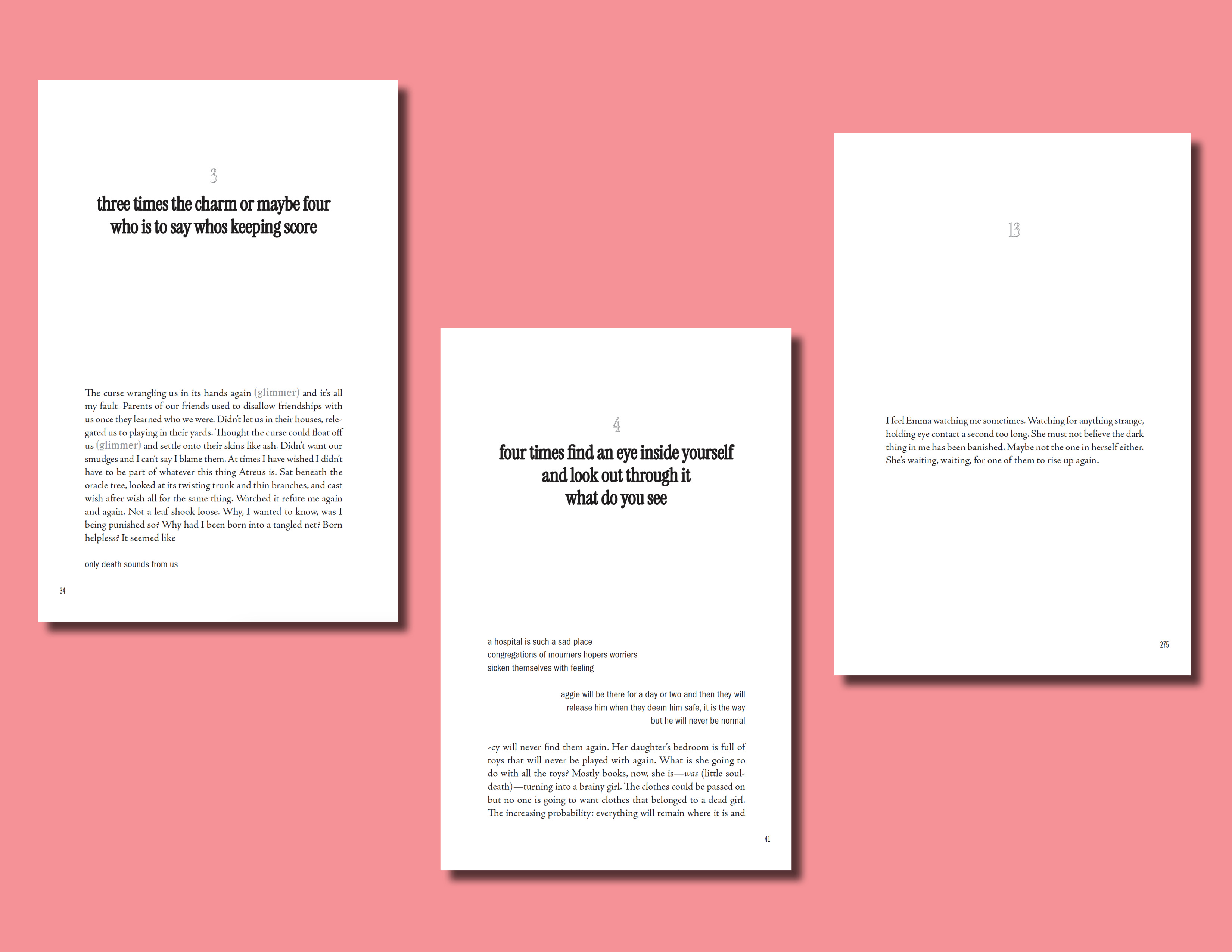
THE BRIEF: A Harvest of Furies is a longer book (75K words) with multiple sections and some special formatting requirements. The text features “chorus” sections—indicating multiple voices—and the recurring phrase “(glimmer),” which required distinctive styling.
MY ROLES: Interior Design / Typesetting / Ebook Conversion
1. The Basics
MARGINS
Top: 0.8 in
Bottom & Gutter: 0.75 in
Outside: 0.7 in
LINE LENGTH
~60-65 characters per line
PAGE LENGTH
33 lines per page
Reasonings / Effects
The layout needed to accommodate both “standard” pages and those with special formatting—ensuring neither looked too dense or empty. Since the stylistic features already added white space, there was no need to make the pages roomier with wider margins and/or tighter leading.
With the higher word count, I wanted to make the pages fit as much as possible without sacrificing readability. This helped reduce printing costs and the physical bulk of the book.
2. Section Titles
FONTS
Section Titles: Instrument Serif
Quotes: ITC Franklin Gothic LT—Demi Compressed
ALIGNMENT
Section Titles: left-aligned
Quotes: right-aligned
STYLISTIC ATTRIBUTES
All caps
Combination of filled and outlined elements
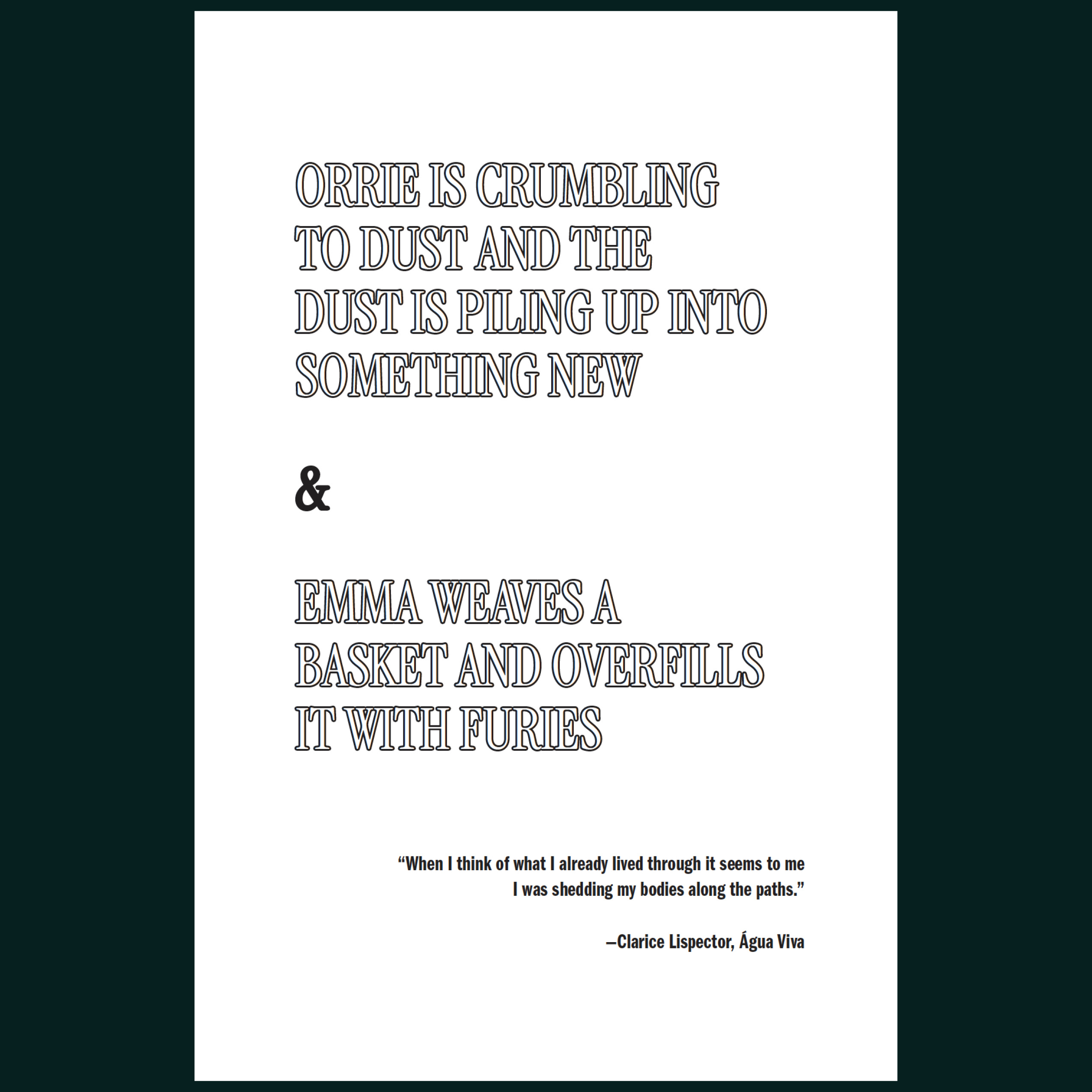
Reasonings / Effects
Section Titles: I chose a font that was similar to the cover title to retain a cohesive look throughout the book. Instrument Serif also looked good at smaller and larger sizes, which was necessary due to varying section and chapter title lengths.
Quotes: The condensed nature of the font used for the quotes pairs well with the section title font (and cover font) because they also have narrow widths. I also considered what tone the section pages should set, and I felt having the quote hanging down at the bottom felt gothic and suspenseful.
Alignment: Left-to-right alignment between the title and quote creates hierarchy and visual movement. Because Hayden also aligned text differently throughout the book, I felt this was a natural extension of this authorial choice. Additionally, keeping quotes on the same page as section titles saves space and strengthens their connection to each other.
Fills & Strokes: I love the fills and strokes (outlined text) in this book. I think they work beautifully, and I was so excited after having the idea. They add contrast, which captures visual interest, while maintaining a classic, literary aesthetic. They allude to a haunting and suspenseful tone and create a unique look for a unique book! I also chose to add a fill to certain elements of the section titles (such as the “&” in the example above) to balance the page and tie in the heavier weight of the quote.
3. Chapter Openings
FONT
Chapter Number & Title: Instrument Serif
ALIGNMENT & POSITIONING
Centered alignment
Chapter title & number positioned in the upper third of the page, with body text starting in the lower third
Chapter openings start on both recto (right) and verso (left) pages
STYLISTIC ATTRIBUTES
Chapter Number: outlined in grey
Chapter Title: black fill
Reasonings / Effects
Chapter titles and numbers had to accommodate various scenarios—some chapters begin with centered or right-aligned text, others with main body text, and some have no title at all.
Fonts: For chapter titles and numbers, I used the same font as the section titles to maintain a cohesive design and tone.
Chapter Numbers: Because there were so many elements to perfect, there was concern about the chapter numbers fighting with the titles for attention. To maintain visual balance and alleviate this worry, I utilized the following strategies:
Style: By outlining the number in grey, it creates a lightness/softness that feels almost ghost-like, causing the eye to drift over the number and to the title. This also subtlety harmonizes with the grey “(glimmer)” styling and the other outlined elements in the book.
Alignment: Centering both the title and number causes the eye to quickly drift down the page without becoming distracted by the number, rather than if these elements were aligned differently (which would cause the eye to stop at one then move to the other).
Title Styling: The title’s heavier weight and larger size pulls the eye toward the title and away from the number.
Alignment & Positioning: Centered alignment anchors the page when dealing with body text that starts in various alignments. Because there are so many chapter openings, having them start on both recto and verso pages further aides in reducing page count / print costs.
Stylistic Attributes: The outlined number and filled title feel like a subtler version of the section titles. And, since it’s almost the reverse (the filled text is now on the main stage, vs. the outlined text capturing the most attention on section pages), it feels like a reflection / mirroring. The elements feel very cohesive and help incorporate symbolism in the book (of mirrors and feeling empty, then full again).
4. Title Pages
(Perhaps my favorite part of the design!)
FONT
Title: Instrument Serif
ALIGNMENT & POSITIONING
Layout mirrors the unique positioning of the type on the cover
STYLISTIC ATTRIBUTES
Half Title Page: filled title
Full Title Page: outlined title, filled byline
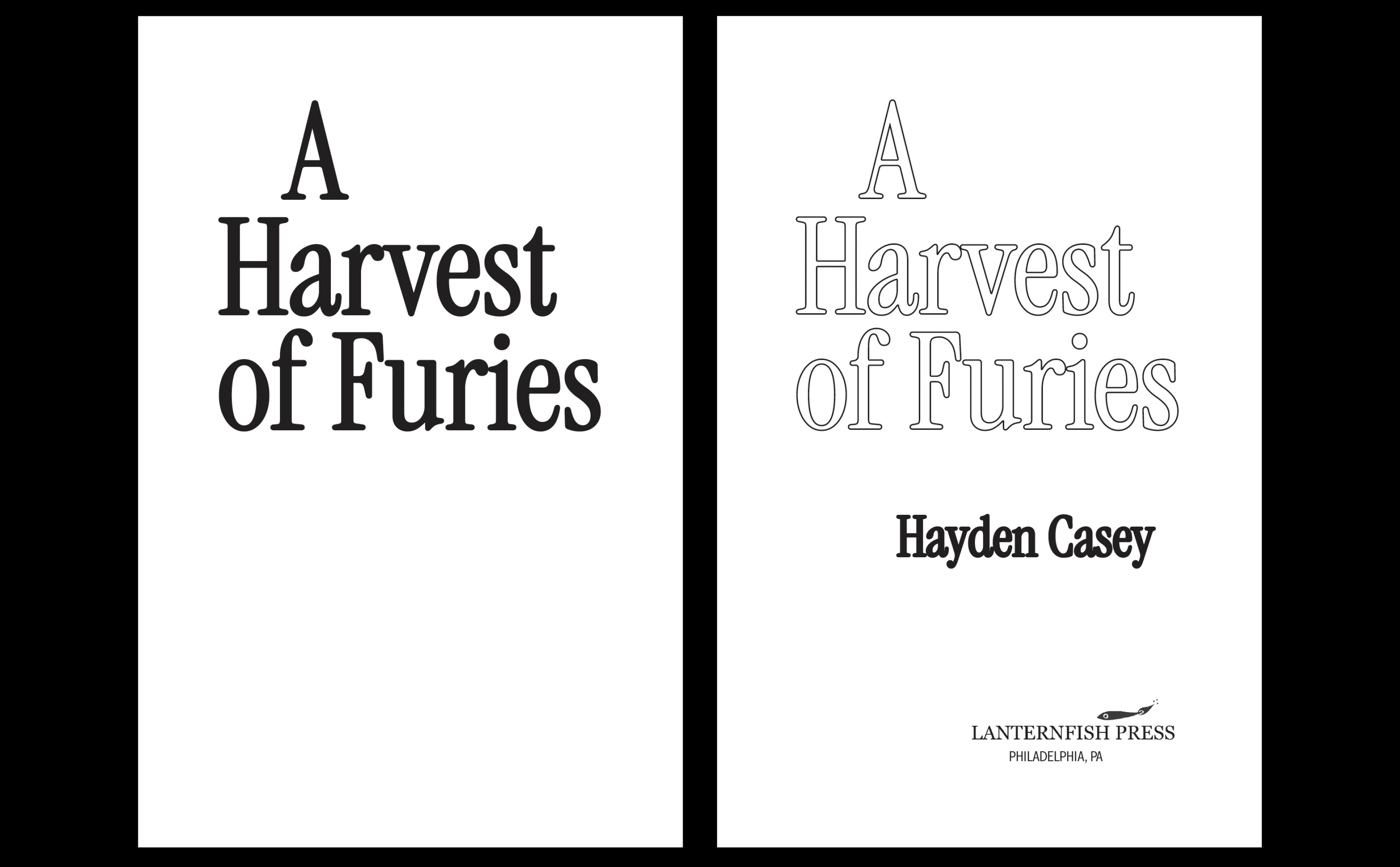
Reasonings / Effects
All of these elements create harmony and cohesion, making the interior and cover all pop and feel so unique to this particular book.
Alignment & Positioning: Positioning the elements in a way similar to the cover creates cohesion and an immediate visual pop of intrigue when opening the book.
Stylistic Attributes: (my favorite part!) When the reader turns from the half title to the full title page, it feels like the inside of the title has been removed. The byline’s fill draws attention to the author name, spotlighting Hayden Casey!
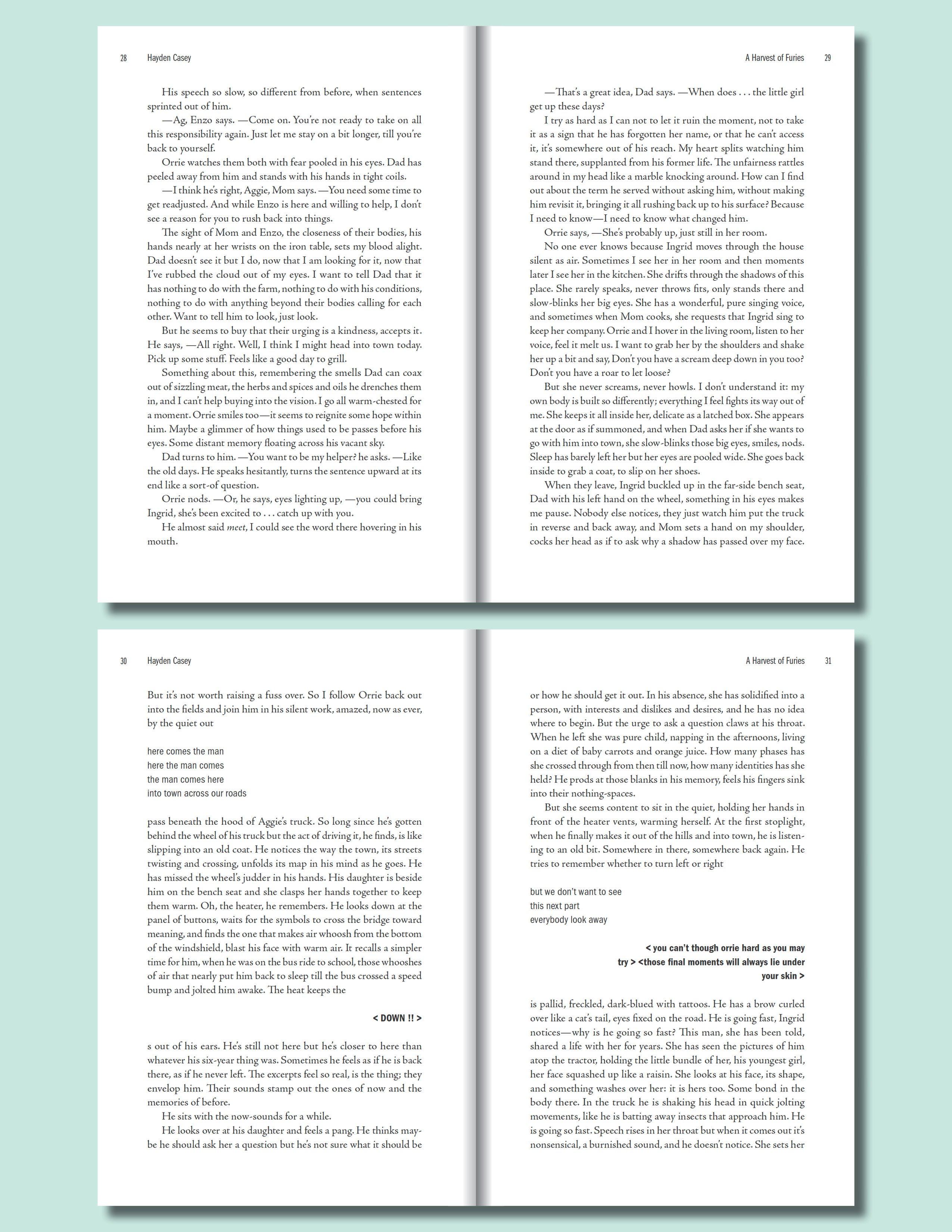
5. Body Text & Special Formatting
FONTS
Main Body Text: Adobe Jenson Pro
Choruses: all ITC Franklin Gothic LT (but different weights)
Center Text & (glimmer): LoRes 21 OT—Serif Regular
STYLISTIC ATTRIBUTES
(glimmer): grey
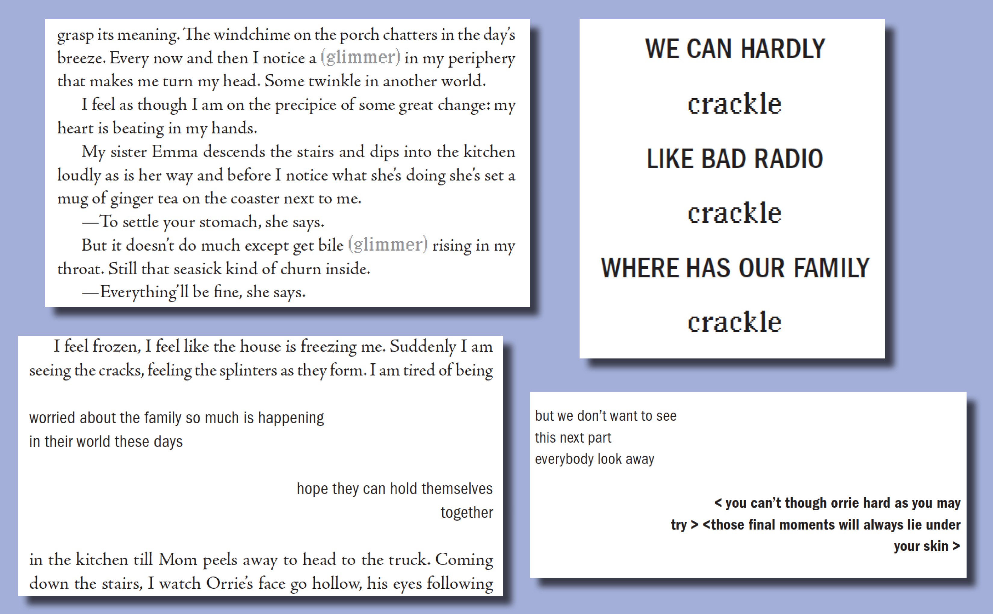
Reasonings / Effects
Body Text: I can’t take credit for this one! This was all Hayden. Christine mentioned that he would love to see Adobe Jenson used for the body text, and I thought it was a great idea. It even has star-like periods, which adds a subtle ethereality.
Choruses: The sans serif font differentiates the choruses from the body text, and varying weights distinguish different choruses. The condensed nature of the font + the lighter to darker shifts in weight contribute to a tense and gothic tone. These sections interact with the reader without overwhelming them with too many visual cues to keep track of, while also imitating how the ghosts fade in and out of the story.
Glimmers: The pixelated font complements the star-like periods in Adobe Jenson and adds a sharpness that feels like a “glimmer” or “crackle.” Using grey also contributed to the (glimmer)s unknown quality (not knowing what they are or where they’re coming from).
Center Text: I used the same font as I did for the (glimmer)s but kept it black, as I thought it should pop out more. I think this sets it apart from the choruses in a nice way, especially when they’re used together.
As a fun little extra, I added a (glimmer) to the copyright page, with help from Christine on the placement. (^:
I really had such a fun time designing this book! I love when all the little details create such a special experience for that specific book. I’m so thankful to Christine at Lanternfish for her continued trust in me, and to Hayden for sharing my love and excitement for typesetting! Preorder A Harvest of Furies!
News for you!
Magazines
꩜ 9 Independent Magazines to Help You Cope with the World Right Now
꩜ Elastic magazine on magculture
Design / Art / Creativity
꩜ Lovely illustrations by Lia Kantrowitz
꩜ I love this interview with Elly Blue on time, creative practice, and following a non-traditional path
꩜ Maris Kreizman on offering and asking for help
꩜ Incredible creative director Arsh Raziuddin talks about design in an interview with The Creative Independent
Publishing
꩜ BISG’s new tool: Find a Rightsholder
꩜ Hayden Casey’s post about A Harvest of Furies galleys
InDesign
꩜ InDesign 20.4 has major accessibility improvements
Submissions
꩜ Journal Journal is accepting submissions until September 1, 2025
What I’m reading
★ House of Leaves by Mark Z. Danielewski (Pantheon, 2000)
★ Gifted by Suzumi Suzuki (Transit Books, 2024)
★ n+1 Issue 49: Rerun (2024)
★ Design Is a Job by Mike Monteiro (Mule Books, 2023)
What I’m listening to


★ Pleasure | Pure X (2011): dream pop / ambient pop
★ Isabel’s Dream | Monomara EP (2001): ambient techno / shoegaze
★ Kate NV | Room for the Moon (2020): art pop / progressive pop
❤︎ Dear Hadley ❤︎
No submissions this month! Click on the button below to ask me something, and I’ll reply to it in my next newsletter.
Send me your InDesign questions, typesetting dilemmas, design rants, freelancing struggles, hot takes—whatever. I’ll respond to them either privately or in my Dear Hadley advice column. Your submission can be anonymous.
Thank you for reading Hadley House!
If you enjoyed this post, I’d love it if you could “heart” it. Your support means a lot. Thank you <3
Need a designer or typesetter? Just want to pop in and say hi? I’d love to talk with you! You can email me at hadleynikolehendrix@gmail.com, or say hello on Instagram / LinkedIn. (^:
Hadley Hendrix is an Editorial Designer based in Chicago, specializing in publication design and typesetting. She works with publishers, magazines, and authors to design, layout, and typeset the covers and interiors of their publications.
Thank you so much for sharing this!