Making a business card
A case study & look inside my creative process
I have recently been lacking inspiration and feeling creatively exhausted, but alas came the time to redesign my business cards. This year I redesigned my website, learned a lot, and became more confident in who I am and what I want to do - so I felt I needed a business card redesign before going to Brooklyn Book Fest.
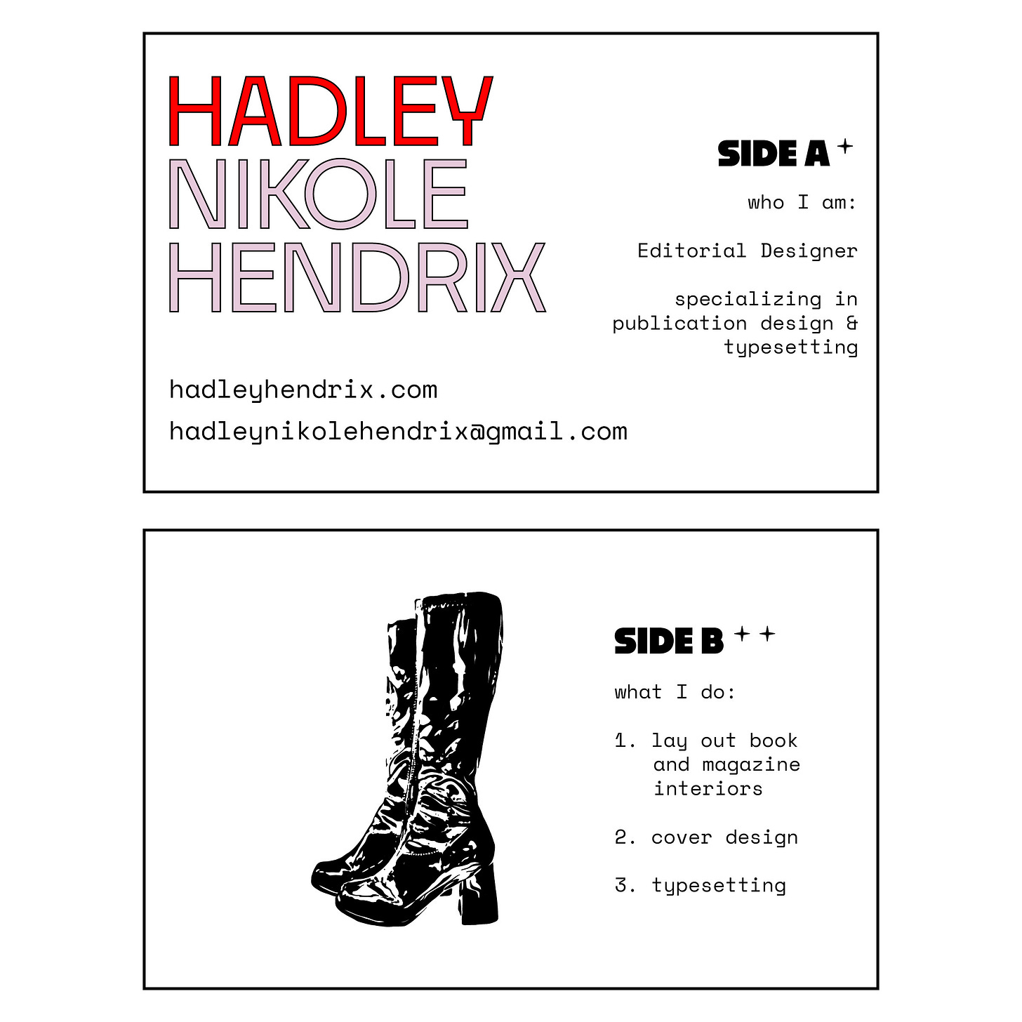
I wanted them to match my website, so I already knew which fonts to use (Noka and Space Mono) and which colors (bright red, light purple, and black) - but I had no other ideas. It always seems a lot harder to work on projects for myself than it is for clients. But I tried to go about this project the same way I would a client project, and I put together a mood board on Pinterest (a much smaller and less detailed one than I’d use for a client, and perhaps this is part of my problem - I spend a lot less time working with myself than I do clients).
I knew I wanted the card to represent me, but I didn’t know how to do that. I scoured my brain for what could possibly represent me and couldn’t come up with much, but from looking at the mood board, I knew I wanted it to…
Be fun and bubbly
Be a little bit dark / edgy / punk
Be artistic, maybe illustrative, but not too distracting
Have pops of color
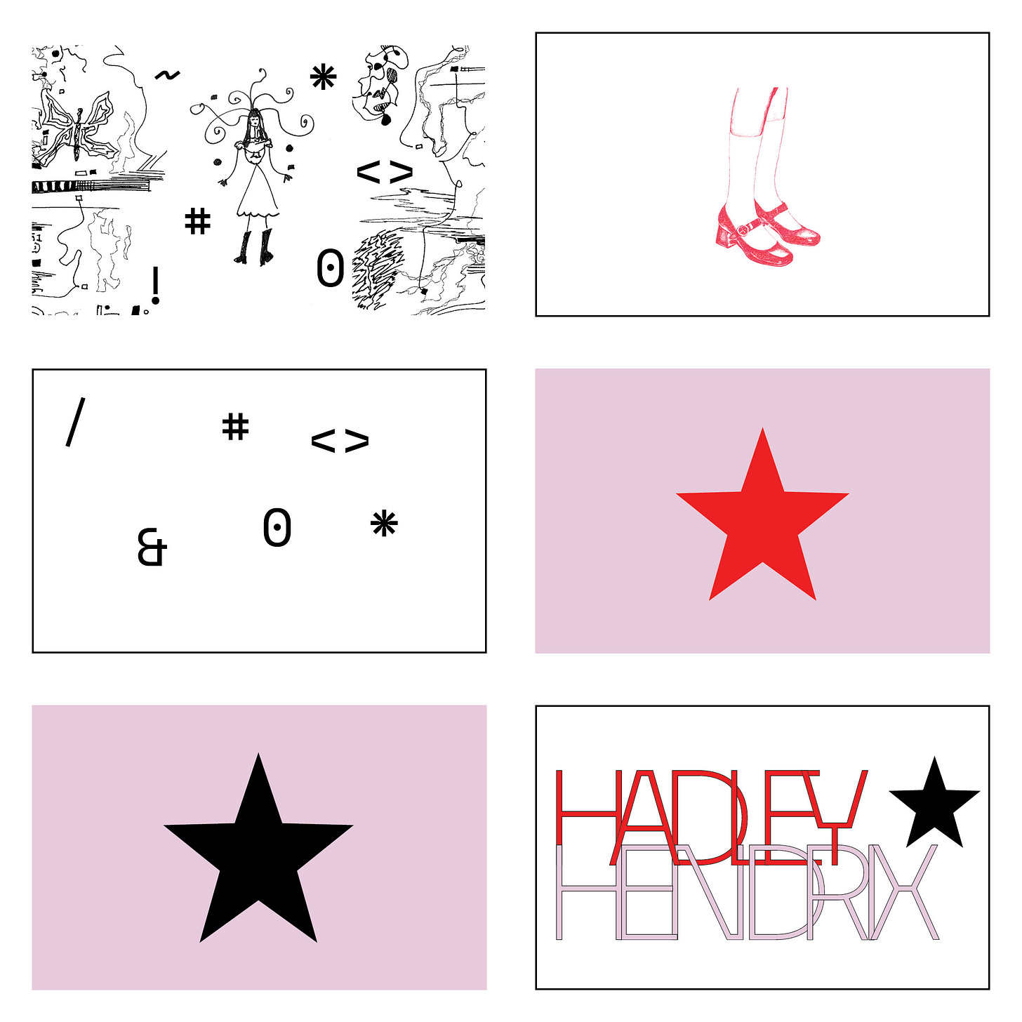
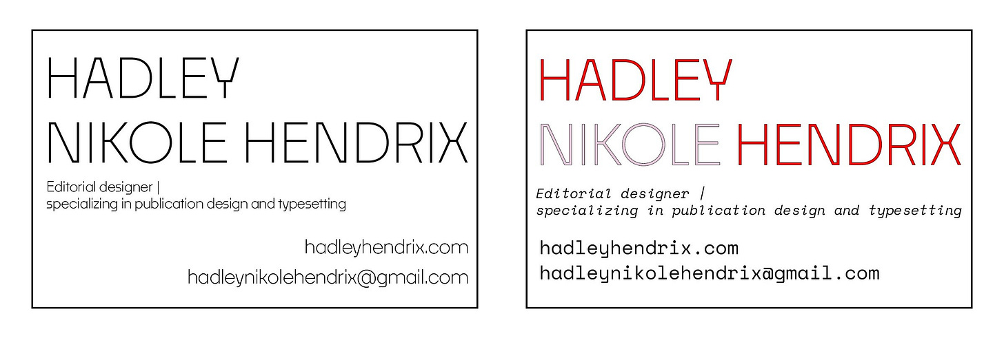
The first day I began working, I just slapped ideas onto the page, and I hated every single one of them. I was thinking clean and big enough to read with a Scandinavian simplicity.
I got frustrated and started working on the back of the card, where I pulled together some illustrative work and doodles I’d done, but it felt too messy or too simple and not edgy enough. I messed around with a star (because I have that set as my favicon here and on my website), and while I like the star, it didn’t fit for the card. It was too mundane, but I wanted to use it in some way because I like it as a favicon (it’s big enough to see what it is and I like stars!). Frustrated, I took a short break, and when I came back, I started messing around with the letters in my name, creating overlaps and tension. I added the star, and I felt a bit better. Then, I messed around with different shapes of stars and added a border. It didn’t feel perfect, but it felt like something I could be content with.
I put it away for the night, showed my boyfriend Alex, and as soon as he started to give suggestions on “what if you do this or that,” I knew he wasn’t sold on any of them either, and I got even more upset. I think I was hoping he’d leap up and down once he saw one of them, and I’d wipe my hands of it and not have to keep working.
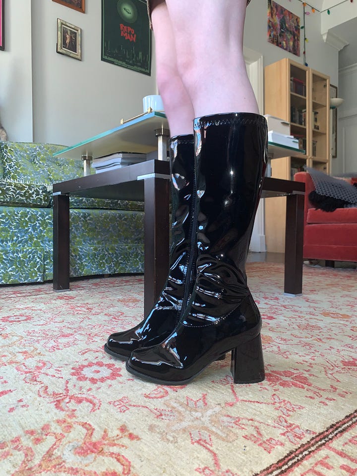
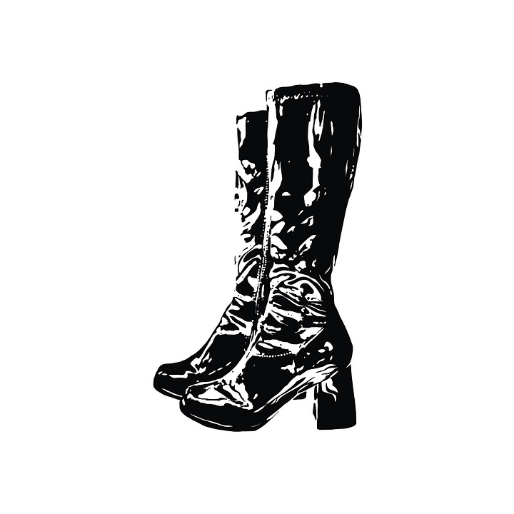
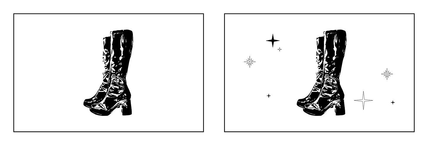
I continued racking my brain for what I could do. Brooklyn Book Fest was coming up in less than two weeks, and I needed to think of something fast so I could have time to proof and print. As I was showering that night, I was thinking of the shoe illustration, how much I love shoes, love clothes, love…patent leather, love…boots, love patent leather boots! Anyone who knows me knows I always wear heels (even when I worked at Reckless Records on my feet for 10 hours every day, I still wore them; they’re my everyday shoes!). I’ve been wearing little block heels since the first grade, I love fashion, and I think boots go with every outfit.
I got out of the shower and told Alex, “I need you to take a photo of me wearing patent leather boots tomorrow. I’m going to draw it and put it on the back of my card.”
And so, he took a bunch of photos of me wearing the boots, I picked out the best one, edited the image to pull out the shadows and highlights, and traced it in Adobe Fresco to create a vector image.
I got back to work the next day and started messing around with how I wanted the front of the card to look. I added colors to my name, a stroke to the letters, and messed with the placement.
I placed my boots on the back of the card and was sold. I loved them. They were simple, edgy, fun, and illustrative. I added some stars.
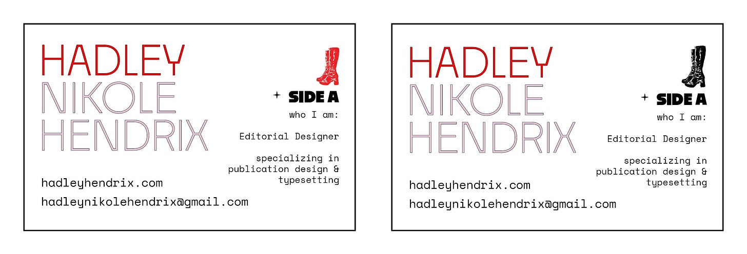
Then, I thought of a record, and for a second I thought “what if I made my business cards a circle?” I realized that was impractical, would allow for less space, and my low-budget printing option of Staples would likely not have that as an option. I looked up some records on Discogs and thought about what I could do to make my card similar to a record - Side A and Side B!
I added some text about “what I do” on Side B, which I thought was perfect because I work in such a niche field, so it’d be nice to have a little explainer on the back. Plus, the 1., 2., 3. reminded me of songs that would be listed on one side of a record.
I messed around with the front of the card some more, putting the boots at the top, changing the color to red, and putting a star to the side.
After printing them out, the stroke and fill on my name seemed too thin, so I increased the weight of the font and put a thicker stroke on the letters. Alex actually said it reminded him of the Human League’s Hysteria typography that I mentioned in my last post, which made me very happy.
Then, it came time to flip through all the possibilities I came up with, print and cut out the ones I liked the most, tweak anything, and pick one.
I got rid of the boots on the front because it felt too busy. I had a hard time choosing the back, but I thought all the stars surrounding the boots made it too cluttered. I loved the simple back with just the boots, but it wouldn’t have allowed me to add “Side B,” and I thought that keeping the expansion of what I do was important and would provide some clarity.
I went with a middle ground, adding two stars beside “Side B” and one star to the right (instead of the left, for consistency) of “Side A.” This allowed me to keep my much-loved star, while making the card cohesive and clean. And, I also fixed the left indent (eek! yikes!) in the numbered list to make all the text align.
And ta-da! There’s my card. (-:
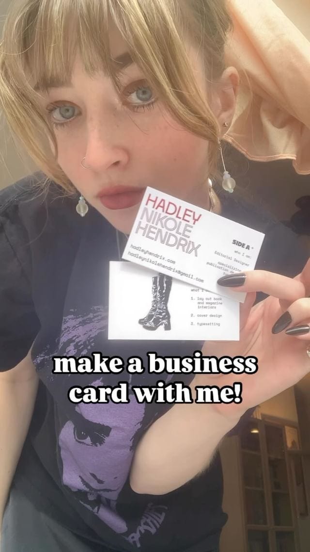
Here’s a process video I shared on my Instagram if you’re interested.
news
Banyan Review’s Fall 2024 issue came out yesterday! I did the design, layout, and typesetting.
One of my favorite book covers right now was featured in Spine Mag’s September 2024 round-up (Necrology by Meg Ripley; cover design by Luisa Dias). This book has been following me everywhere! I first saw it on Pinterest, added it to my book covers board, stumbled upon its publisher accidentally (Creature Publishing), then went to BK Book Fest, purchased the book, and got Meg Ripley to sign it (and she gave Hanna and me cute book-themed stickers).
what i’m listening to
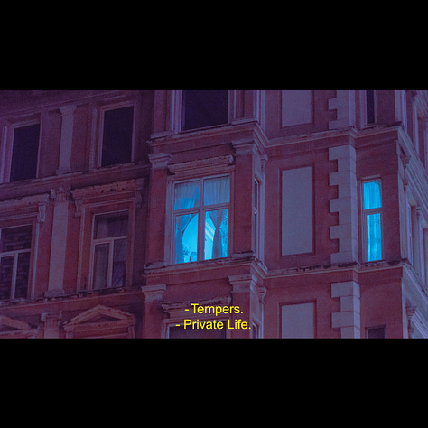
Tempers | Private Life (2019): darkwave, dream pop, synthpop
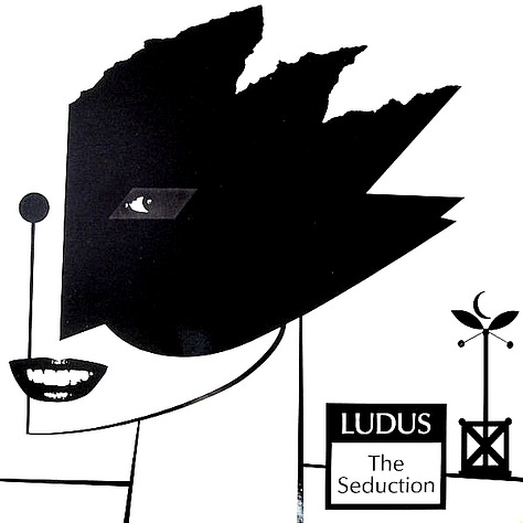
Ludus | The Seduction (1982): post-punk; art punk
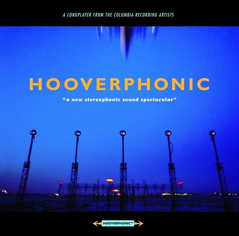
Hooverphonic | A New Stereophonic Sound Spectacular (1996): trip hop, dream pop (reminds me of something that would play at The Bronze in Buffy)
what i’m reading
A Change of Time by Ida Jessen (Archipelago)
Puerto del Sol - Issue 58.1 | Spring 2023 | “Touch”





I love your creative process and the amazing results.