

This month’s newsletter acts as a sort of mood board to show you the inner-workings of my mind, what designs are lingering in there, what colors are splashing around, what layouts are piecing themselves together, and just what makes me inspired.
Typography

As a Scandinavian, I was intrigued to see that Norwegian embroidery inspired this font. I’ve found myself drawn to a number of pixel fonts recently, and I’m quickly seeing them rise in popularity. Perhaps seemingly quite similar at first glance, pixel fonts bring to life many unique memories (retro video games, old computers, an edgy elegance, or even embroidery). In Agathe’s font, I see my Danish Nana’s knitting. It is a perfect display font for a project that wants a maximalist and striking look, while achieving the comfortability and nostalgia of a hand-knit blanket.
Album covers
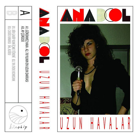

Anadol - Uzun Havalar: (progressive electronic, hypnagogic pop) The font, colors, layout, placement - everything is working! The cool green tones in the photograph are brought out through the soft green in the letter “D.” The red used in the type pops and creates harmony with the soft green. I like how the artist’s name looks stamped, how the “A” and “O” have their own distinct flair. The hierarchy is clear with each element’s weight distributed to create a perfect balance. The eye is drawn to the photo, then to the artist’s name, then the album’s name, and finally makes its way to the track names.
Björk – Greatest Hits: (art pop, electronic) We all know Björk! She is an Icelandic fairy, she is experimental, she is fun! I think this album cover captures this eccentricity. The illustration is so weird and cute, a little blob that looks like a happy germ. Why add color? It’s already so fun! Black and white is simple, elegant, and provides the perfect energy to make the artwork stand out all on its own.
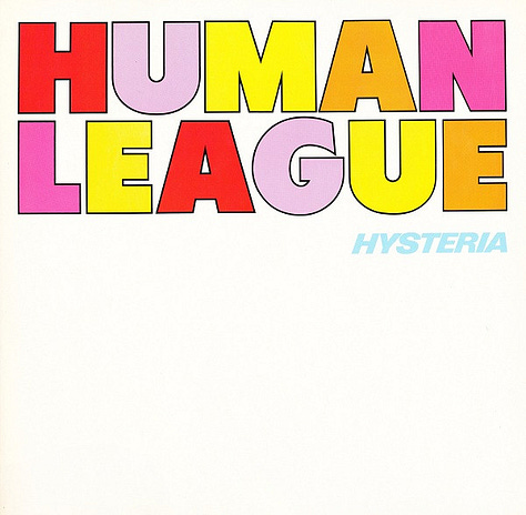
Human League - Hysteria: (synthpop, new wave) If you know me, you know I love The Human League.
side note: when I worked at Reckless Records, I found an original pressing of this album in Near Mint condition for $8. I was shocked. “Why is The Human League only $8? It’s an original in NM condition,” I asked one of my coworkers. “I hate to say this, Hadley, but The Human League is kind of a budget bin band,” my coworker Jon said. I couldn’t believe the atrocity! A budget-bin band? Though the social consensus is dead wrong, I now happily own an original pressing of Hysteria (and Dare).
It’s now become a joke among my coworkers about how much I love The Human League, and just the other day when I stopped into Reckless, my coworker Spencer was playing an original pressing of Hysteria, and he apparently joked about how he was going to summon me by playing this. A few songs later, in I walked!
Anyways, this is a beautiful typographic design. It is so fun and 80s with its use of bright, alternating colors. It’s contained, however, using a limited color palette and making great use of negative space, with all the weight occupying the top of the cover. I must admit, though, that this is the inner sleeve and not the cover (the cover wraps the text around the front and back - a choice which is interesting and distinctive, but which I’m still unsure if I like).
Book and magazine covers


Gifted by Suzumi Suzuki (Transit Books, cover design by Luke Bird): Forthcoming in October 2024, this book has a very enticing cover (it kind of reminds me of the Anadol album cover above). Everything leads to each other, interacts, and connects. There are three distinct blocks on the cover, emphasizing separation and splitting. Black and white ground the cover; red makes it pop. The photograph and the red warns of danger. The typeface is a simple serif with a subtle edge to it.
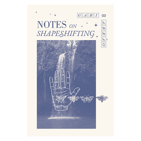
Notes on Shapeshifting by Gabi Abrão: I love this monochromatic, faded cover. It is so soft and dainty. The illustrations overlapping the photo add complexity and flavor to this otherwise simple cover. The title captures a magical quality, with not all the letters being the same (noticeable in the “S”’s), and the stars add a sparkle without taking away from any of the other elements. I also love how this “sparkle” is emphasized in the way the author’s name is designed in little studded boxes.
sexxx by Numero: This cover is so sexy and fun. Numero’s fashion-forward nature comes through in the photograph with an added spice. I love how the red lipstick is complemented in the red font. The red type on the black background adds further edge and a sultry tone. The “sexxx” title overlayed on the face with the black outline makes it bold and moody.
Layout
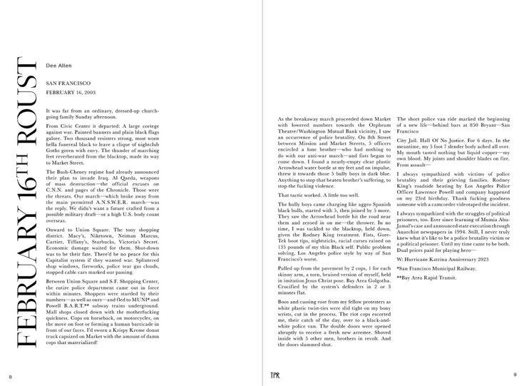
In trying to explore more of my Danish side, I’ve become a bit more fond of designs that are minimal and subtle as opposed to my usual tendency toward maximalist and vibrant designs. I stumbled upon this layout recently by The Palisades Review, and I think it does a beautiful job at using negative space to create concentrated blocks of text on the spread. I find this layout clean, sophisticated, and approachable. As I write this, I’m also noticing my fondness for rotated text.
news!
My dear friend Ramses Allen has completed not one but two of some of my favorite portraits he’s created (and they are both of one of my best friends, Hanna Hadzic - an incredibly bubbly gal who is an amazing muse)
Trio House published two more interviews with Christian Gullette and Susan L. Leary!
what i’m listening to
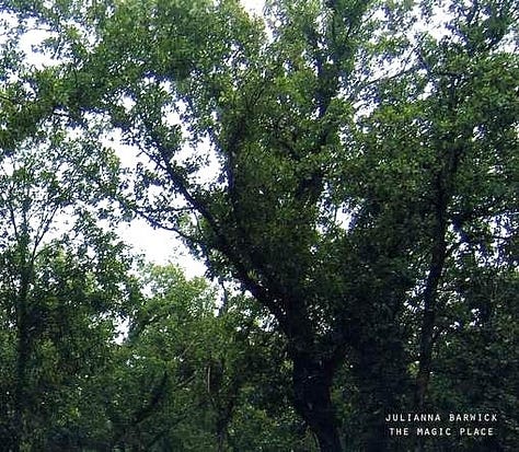
Julianna Barwick | The Magic Place (2011): ambient, ambient pop
oOoOO | Our Loving Is Hurting Us (2012): witch house; alternative r&b
Susumu Yokota | Kaleidoscope (2010): ambient
what i’m reading
On Writing by Stephen King
crazyhorse Number 101 | Spring 2022 issue
The All New Print Production Handbook by David Bann


