

Preparing a Screenshot for Print
This is an archived post from Book Design Made Simple.

In October 2026, the website BookDesignMadeSimple.com (founded by Fiona Raven and Glenna Collett) will be closing, and their co-written book will no longer be available for purchase.
While this is incredibly bittersweet news, Fiona and Glenna have generously allowed me to archive their blog posts on Hadley House to avoid having them disappear with their website. You can find all of their archived posts here.
Fiona and Glenna have made a huge impact on my life, teaching me so much about book design and giving me the hope, motivation, and confidence to succeed in this field. I am eternally grateful. It is an honor to learn from them. I think you will feel the same <3
Originally Published: March 19, 2015
By: Glenna Collett
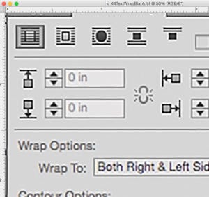
Have you ever tried to add an image on your screen to your printed materials? And noticed that it looked terrible in print—all blurry and pixelated? We had the same problem! Our book has a lot of screen shots in it. We mean a LOT. We use them mostly to show you InDesign dialog boxes—each view of the screen saves many words.

The task of making our screenshots crisp and legible in print fell to me. After I stumbled around trying various methods, I came across one particular YouTube video that steered me in the right direction—I enthusiastically thank Tim Mayes for posting it. After I tried his method, I made a couple of adjustments, and here are the results:
1. Take the screenshot. On a PC, use the Snipping Tool (click the Start button, then Programs > Accessories). Select New and your whole screen fades a bit, then drag to select the area you want to grab. On a Mac, type Command + Shift + 4, then drag the little symbol to select the area you want to grab. The result is a PNG file you can save.
2. Increase the resolution. Open the PNG file in Photoshop and go to Image > Image Size. Check the Resample box. In the resolution area, pick 300 ppi. Then change the physical dimensions to just a bit larger than the size you will use in your book or publication. Click OK.

An example at 300 ppi is shown below. It looks blurry, right? And there are traces of pink and blue all around the letters (called color fringing).
3. Remove color fringing. Get rid of the color fringing by going to Filter > Noise > Reduce Noise, then use these settings (shown below): Strength: 6%; Preserve Details: 60%; Reduce Color Noise: 75%; Sharpen Details: 75%. Click OK.

4. Optimize for the printer. There are a few things you can do to make your file size as small as possible (important if you have lots of images!), and to save your image in the best format for printing:
Flatten the image (Layer > Flatten Image) to reduce the file size.
Convert to your printer’s recommended CMYK or grayscale profile (Edit > Convert to Profile). If your printer hasn’t specified a color profile, choose a CMYK profile for color printing such as U.S. Web Coated (SWOP) V2, or a grayscale profile for printing with black ink such as Gray Gamma 2.2.
Save as a TIFF file (see below, choose IBM PC or Macintosh depending on your computer), and you’re done!

Here is what the BEFORE example above looks like after taking these steps:

From the BEFORE and AFTER images above, it’s hard to tell the difference because your monitor shows everything at 72 ppi. But test it yourself by printing a page on your laser printer or by sending some pages with files like these to your local copy shop.
Remember, this method is only for screen grabs consisting mostly of type, not for photos or art that you might take from your screen. I think it greatly improves the quality, but you might find that this is merely a good starting point. If you only have to reproduce a few screen grabs, you can zoom in on each and touch them up in as great detail as you like.
Good luck!