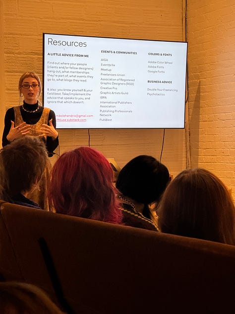


Last week I had the amazing opportunity of giving guest lectures to two design classes at NYU (many thanks to Professor Jeff Stark for inviting me). I walked through the process of designing my business card, but more than that, I hoped to give advice that applied to something much broader: how to represent yourself, how to apply the principle of “specificity = universality” (a theme drilled into my brain after graduating from Douglas Anderson’s Creative Writing program) to your position title / logo / brand identity, and how to “network” (a term I’ve been averse to because it takes on a meaning of ingenuity and promoting inauthentic relationships; instead, I think of it as simply “socializing” and building a community). It was a lovely experience, and I’m glad I was also able to see my friends for Thanksgiving while there. <3
To commemorate my experience speaking with the NYU students, I want to use this article to share what I wish I knew about InDesign when I began laying out and typesetting publication interiors. I hope that by continuing to share the knowledge I have, you may feel inspired and encouraged—or at the very least, you will hopefully not make my same mistakes or use the incredibly round-about methods I’ve employed along the way!
Before moving on, I want to state what may seem obvious: it is completely okay to still be learning something. In fact, I devote 1 hour to learning before beginning work each day. In no way do I think that I know everything about InDesign. No one knows everything, and we can all learn from each other. I’m sure I could learn something from you, dear reader!
There’s a societal tendency toward emphasizing what we know and refraining from asking for help. I think this is silly and fosters a “me vs. you” mindset, which reinforces the individualist culture prevalent in the US (and which I am a strong opponent of). I have asked for help from others, and on many occasions was ignored or discounted. I do not ever want someone to feel like they can’t ask me a question or share something with me.
Not everyone has the means to pave their own path. I aim to create a space where the collective well-being is highly valued, where individual success is not at the expense of others, and knowledge is shared. (My Danish principles are showing here.)
Without further ado, here are some things I wish I would’ve known about InDesign!
1. Apply your character styles first
Do:
Apply character styles first, then paragraph styles. It retains all the character style formatting (so all words or phrases in italics, bold, small caps, etc. will still be there after you’ve applied paragraph styles).
Don’t:
Apply your paragraph styles first → you eliminate all local formatting / overrides, thus making it impossible to apply the character styles automatically.
This ends up looking like you, staring at your screen split in two, with your InDesign window on one side and the manuscript in Word on the other, meticulously combing through and staking out each local override in the Word doc to apply it manually in InDesign.
2. Character & paragraph styles r ur bff <3
I think I laid out 3 or 4 books before I learned what character and paragraph styles were. And, when I figured that out, I probably laid out 2 or 3 more publications before realizing you do not, in fact, have to apply everything in your paragraph style + the formatting change to italics to get your text to change to italics.
Do:
Only specify what you want to change in a character style (make it bold, italic, etc.). Leave everything else blank (don’t touch the font family, size, style, etc. if you only want to make something small caps!).
Don’t:
Add anything that’s unnecessary to getting that character (word, phrase, letter, etc. within a paragraph) to change (most of the time, you only need to apply 1 formatting change to the character style to get what you want).
3. How to delete parent page elements
Do:
CTRL/CMD+SHIFT and click on any parent page element on a document page to select, delete, or change it.
Don’t:
Place boxes with paper color fill on top of page numbers to “delete” them (yes, I’m ashamed to admit I did this for my first couple books).
4. Automate your Table of Contents
It took me forever to learn how to use the Table of Contents (TOC) feature, then even more time to learn how to use it properly (and, I still think there’s room for improvement—isn’t there always?).
Do:
Apply paragraph styles appropriately throughout your entire manuscript so you can easily add them to the TOC
Example:
Layout → Table of Contents
Title: Contents | Style: [choose a paragraph style you’d like this heading to be in, or make a new one; I like to create a new one so I can tweak the appearance of the contents heading without affecting anything within the book]
Include Paragraph Styles: click on the paragraph styles in Other Styles that you want to add (these are the items you want to add to the TOC: chapter numbers, chapter titles, back matter headings, etc.) → Add
Make sure there’s a blue button on the right side of the panel that says “Fewer Options” → if it says “More Options,” click it so it shows the entire panel
Click on each paragraph style under Include Paragraph Styles and make necessary adjustments. For ct [chapter title], I may do the following:
Entry Style: [choose a paragraph style you’d like this item to be in, or make a new one; again, I like to make a new one]
Page Number: After Entry | Style: [None]
Between Entry and Number: ^y (this aligns the page number on the right margin) | Style: [None]
Level: 1 (I usually leave everything at Level 1)
Options: check the following…
Create PDF Bookmarks (you can look at these bookmarks in Acrobat after exporting)
Remove Forced Line Break (removes any forced line breaks from the TOC that are present in the manuscript, such as within a chapter title)
Sometimes, I like to create my own TOC because I have a bit more control over the design and placement (but again, perhaps I need to learn more about the TOC feature). Regardless, if I ever manually make the TOC, I will still create the automated one because I can update it as needed without flipping through the entire document to see what page number goes where, leaving room for mistakes.
When this happens, I create the automatic TOC as usual, then add it to the pasteboard, so I can copy and paste what I need from it into my manually created TOC. (Copy/Cut & Paste is your friend; do not type things yourself!)
Don’t:
When I was figuring out the correct way to use the TOC feature, I was working on a literary magazine, so I had to make sure the title and contributor name for each piece was in the TOC. I thought I had to create hidden elements on every page that I wanted to be in the TOC, with the title and contributor name repeated in the hidden element. I’m not sure if you can even understand what I mean by that because it was truly one of the most round-about things I’ve ever done. And, though it did work, it took so much time.
So, don’t do that.
5. InDesign Preferences
What a joy to have discovered all that’s available in the InDesign Preferences. If you open Preferences (Mac: InDesign → Preferences; Windows: Edit → Preferences) when you’re on the Home screen, any changes you make will apply to all files. If you open Preferences when you’re working on a file, it will apply these changes to the open file.
Do:
Explore the Preferences panel
Preferences → Composition (one of the most useful sections when typesetting)
Recommend turning on H&J Violations (highlights in yellow where justified text could be improved) → helps you spot rivers and crammed text
Recommend turning on Custom Tracking/Kerning (highlights in teal where you’ve applied local tracking/kerning)
Dear Reader...
Do you have something you wish you’d known (about InDesign or something else), or maybe just a piece of knowledge you’d like to share?
I’d love to hear it. Leave a comment, email me, or message me below, and feel free to ask me any questions or tell me what you’d like to hear more about in a future post. I respond to every message. (^:
news
Only 1 in 4 European publishers produce accessible ebooks: This article sheds some light on the EU Accessibility Act, which will go into effect June 2025.
An amazing article from Laura Brady on how you can incorporate accessibility into the editorial process (and make your typesetter’s life a little easier!)
The cool factor of zines draws brands and hurts publishing: Explains one way in which corporate greed capitalizes on zines, while ignoring what makes independent zines special: building community.
what i’m reading
Lecture by Mary Cappello (Transit Books, 2020) - (This would’ve been good to read before my guest lectures!)
The Intellectual Situation: The best of n+1’s second decade (n+1 Foundation, 2024)
Getting Your Sh*t Together: The Ultimate Business Manual for Every Practicing Artist by Karen Atkinson & GYST Ink (GYST Ink Press, 2014)
what i’m listening to


Halo Maud | Je suis une île (2018): French pop, psychedelic pop
Kelly Lee Owens | Dreamstate (2024): progressive house
Polyrock | Polyrock (1980): new wave, post-punk
Thank you for reading Hadley House!
Subscribe to receive new posts about editorial design resources, inspiration, typesetting, tips & tricks, and more.
And, in case you missed it…
My last article details the process of designing a book cover.
Hadley Hendrix is an Editorial Designer based in Chicago, specializing in publication design and typesetting. She works with magazines and publishers to design, layout, and typeset the covers and interiors of their publications. From ensuring an authentic representation of a publication to using em dashes and en dashes correctly, she immerses herself in the details of every project to create a polished product. Visit her website to see some of her work.
Need a designer or typesetter? Just want to pop in and say hi? I would love to talk with you! Please email me at hadleynikolehendrix@gmail.com, or connect with me on Instagram or LinkedIn. (-:


